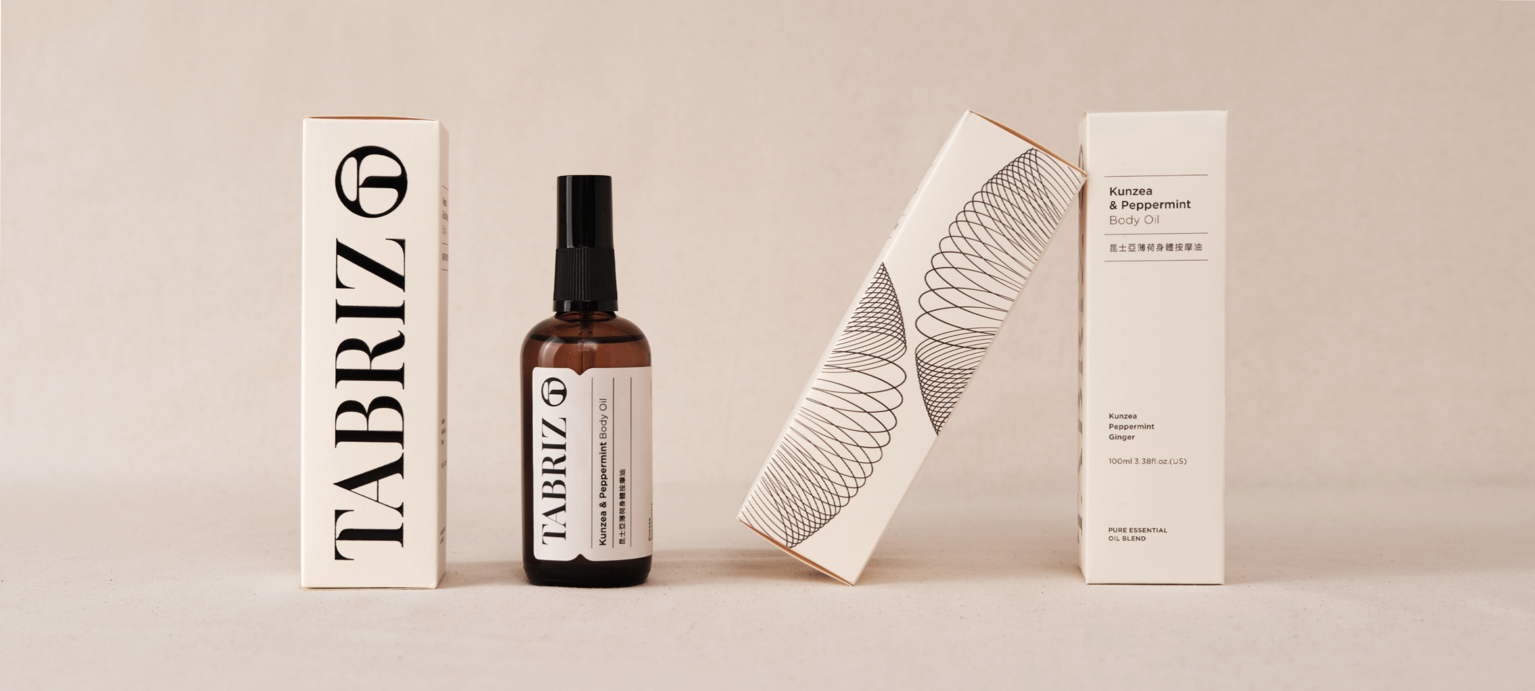
TABRIZ, a brand with 30 years of history in the beauty market, uses its factories to strictly control raw materials and procedures for the high-quality control of its products. To pass down the great feelings from the natural scents, they lead people to explore their inner feelings with the fragrance of essential oils. Combining their professional experience and endless innovation brings a brand new image to the consumer markets.
The brand's logo mark design has the concept of the clarity and transparency of water droplets, combined with the brand name's first letter, "T," to convey the brand's natural and organic goals. For designing the logotype, we bring the logo mark's visual gene and combine it with strong strokes contrast to emphasize independent character in modern visuals. Furthermore, the brand's color scheme choose cream and black to create pure and natural visual feelings.
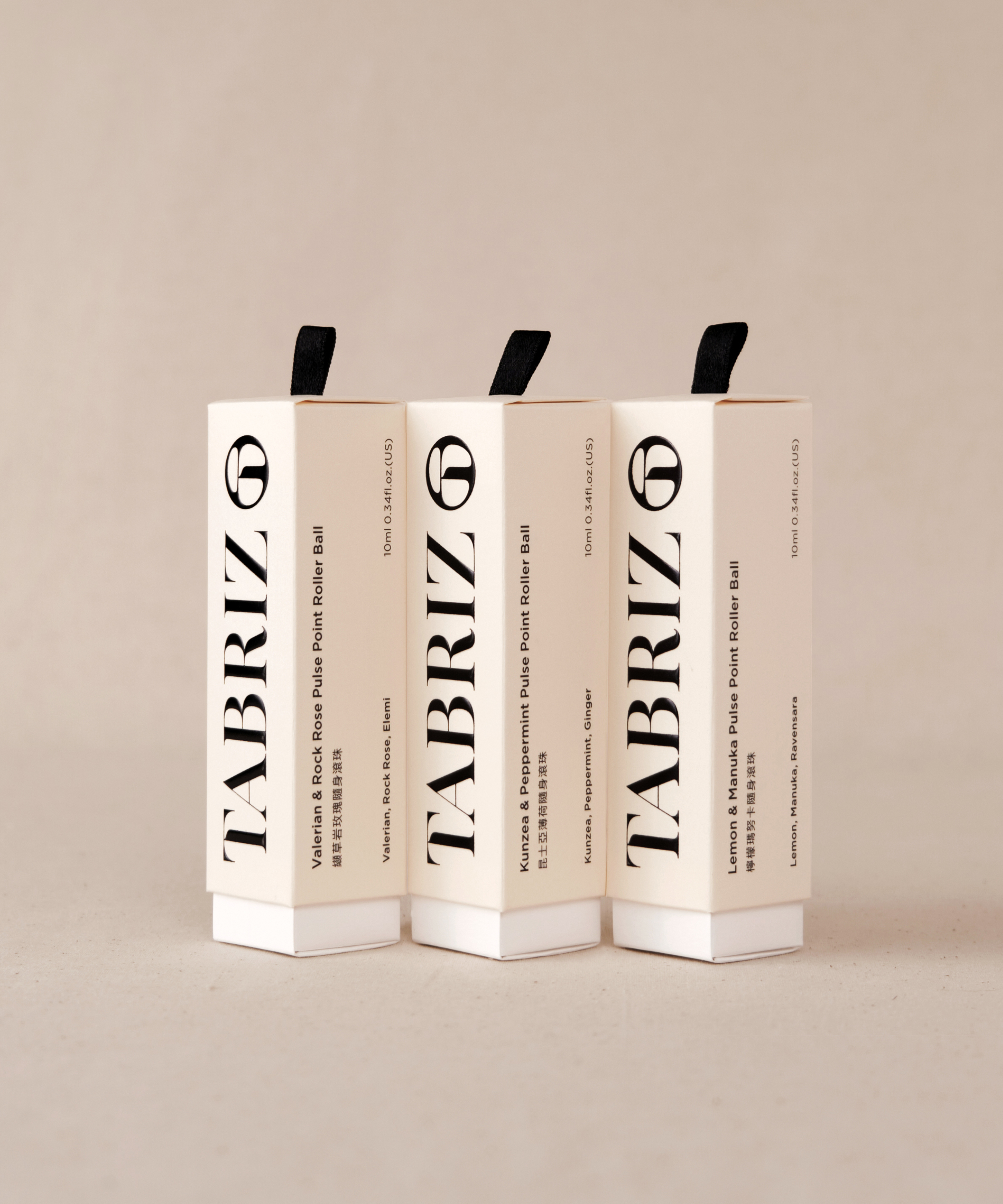
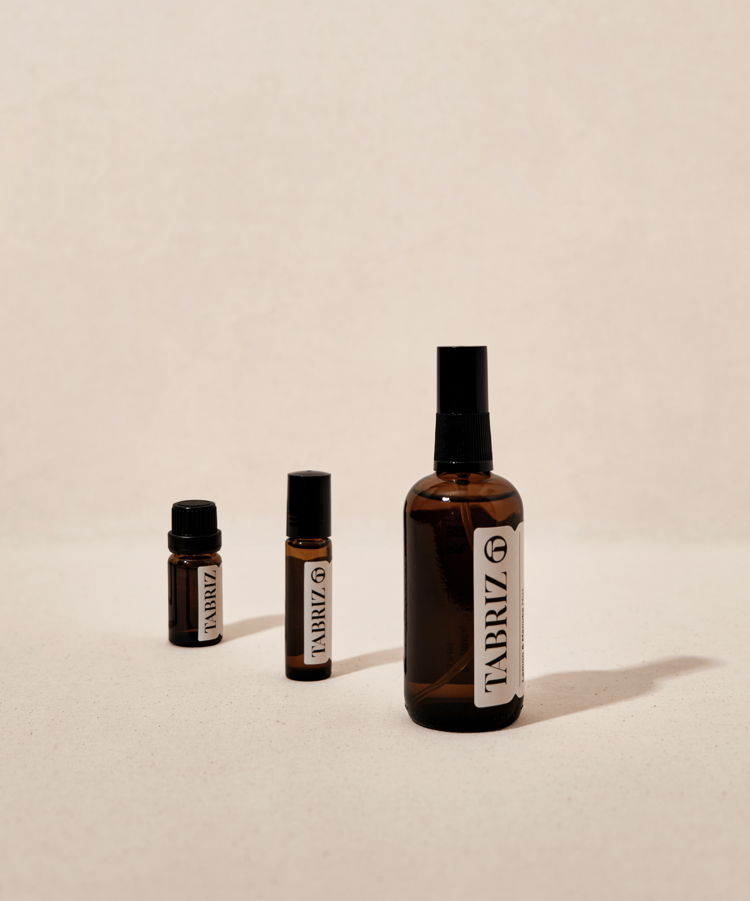
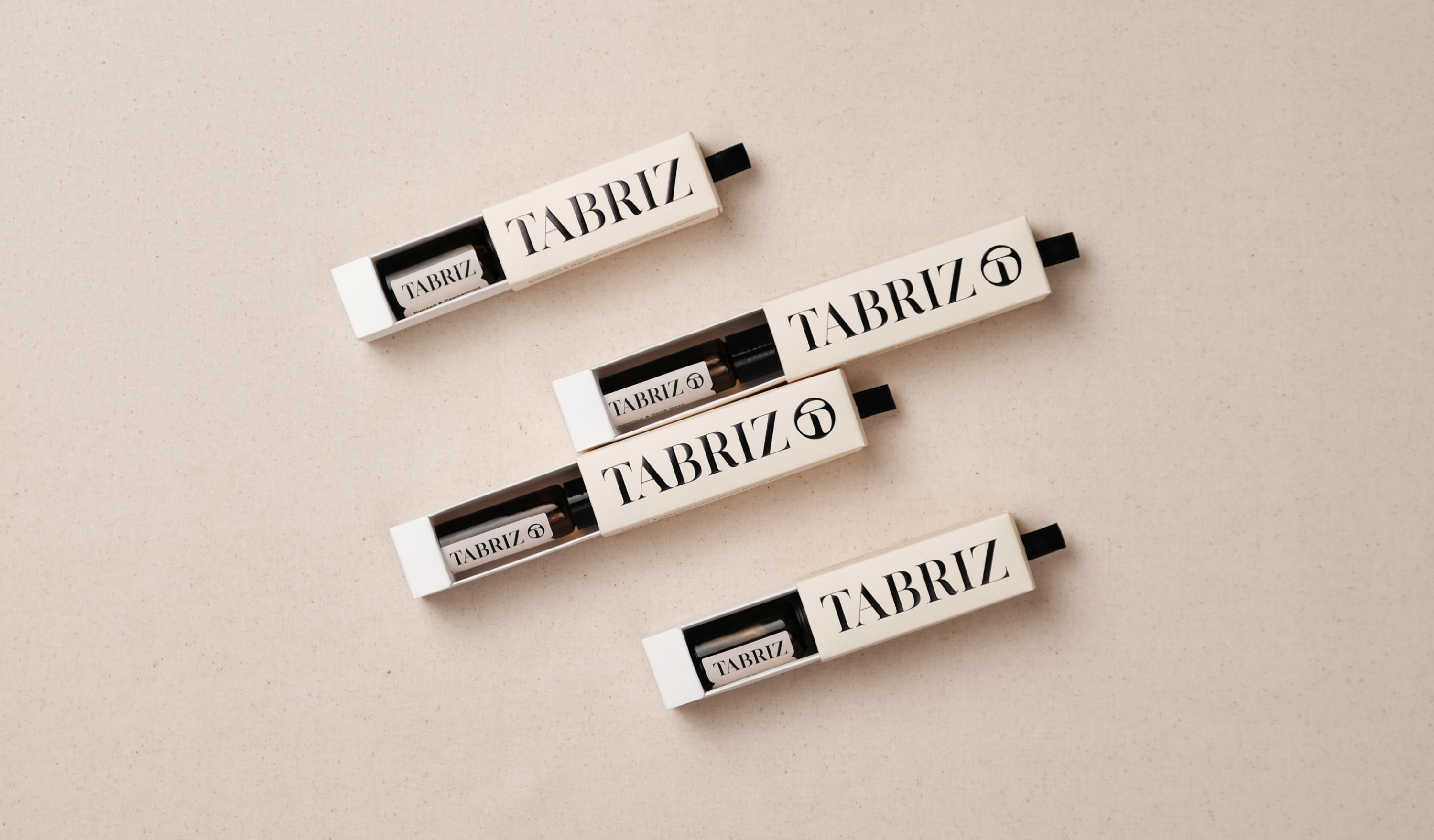
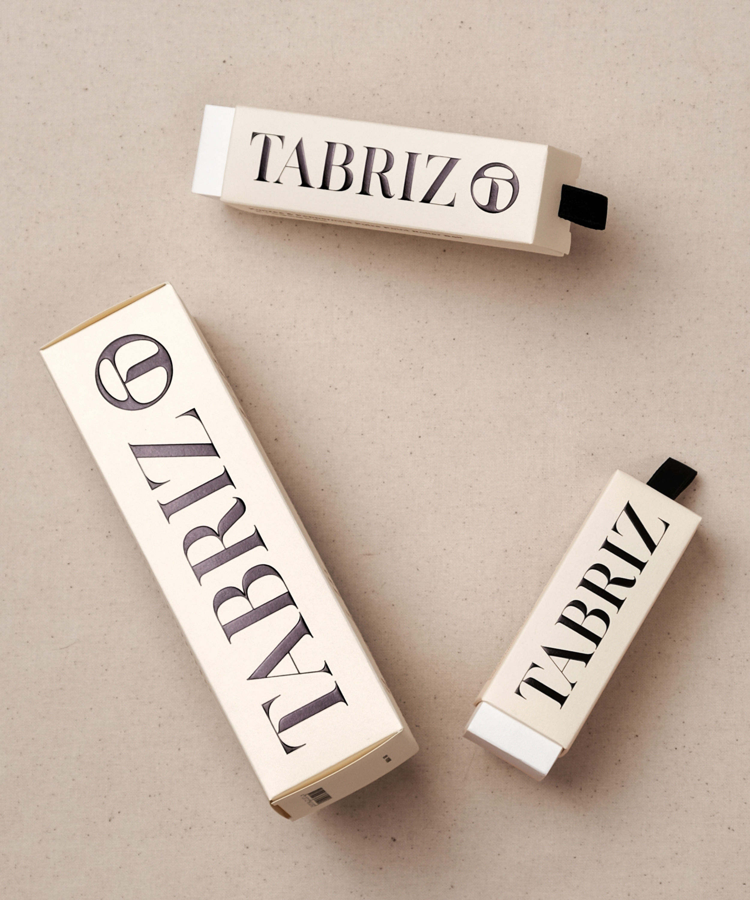
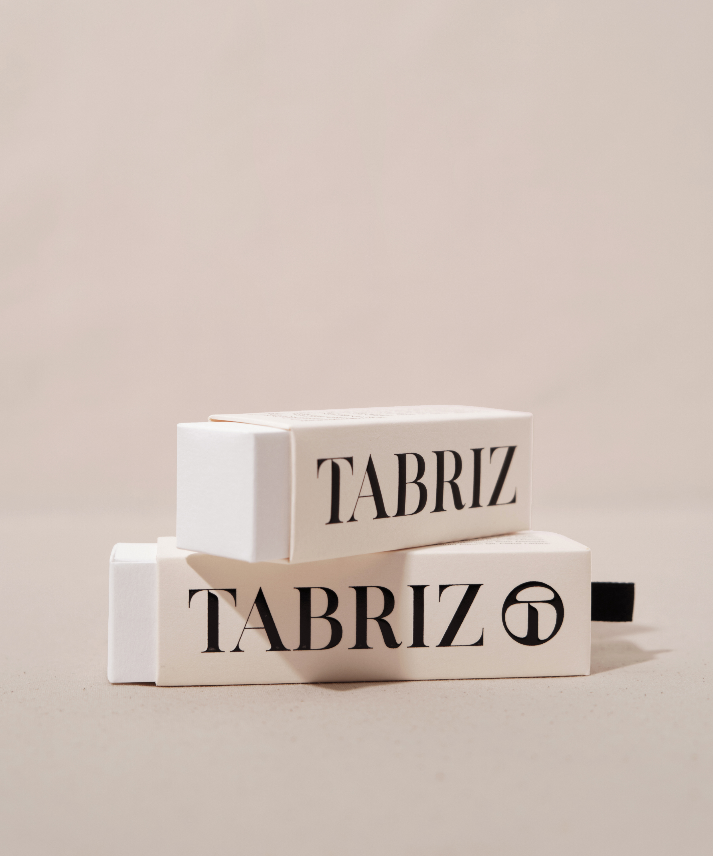
The overall packaging image extends the brand's goals, creating a natural and organic image. By selecting FSC-certified art paper and its color as brand color, with clean and straightforward visual language, to convey the brand sprint of "KEEP IT CLEAN AND SIMPLE." The print design uses the techniques of embossing and UV printing to deepen the concept of the brand's logo mark, which is like a water droplet. Presenting the logo mainly on the packaging series helps the consumer market remember brand identification.
深耕美容芳療產業 30 年的 TABRIZ 泰莉姿,以自有工廠的作業程序和嚴格把關原料調配確保產出品質的堅持為理念。為了傳達天然氣味的美好、藉由精油芬香引領人們探索內心的感受,TABRIZ 結合自身專業經驗及持續創新的思維,以全新品牌形象走進消費者市場。
標誌圖像以澄澈透明的水珠精華為概念,結合品牌代表性字母 ”T”,連結 TABRIZ 天然有機、化繁為簡的品牌訴求;打造帶有標誌基因、對比強烈的標準字,強調現代且獨立自主的性格。整體色彩規劃以奶油色及黑色為基礎,塑造純淨天然的視覺氛圍。
包裝形象延續品牌期望打造天然、有機的形象感受,選用FSC認證美術紙並取其色樣作為標準色,以直覺與簡約的風格呈現。意圖讓大眾從包裝體驗 TABRIZ 期望傳遞 “KEEP IT CLEAN AND SIMPLE” 的品牌精神。在印刷設計運用打凸及燙色的手法,加深標誌如水珠般透亮的識別概念印象,大面積將識別導入於產品系列包裝的同時,也助於消費市場對品牌識別的記憶度。
T Branding, Packaging Y 2022 CD Chi Tai Lin AD Yu Chien Lin D Allison Hsiao (Packaging), Wei Yun Kan (Identity) PM Yu Chien Lin PH Allison Hsiao C TABRIZ










© 2015 — 2026 不毛 nomo®creative


