


WINNOVATION
branding
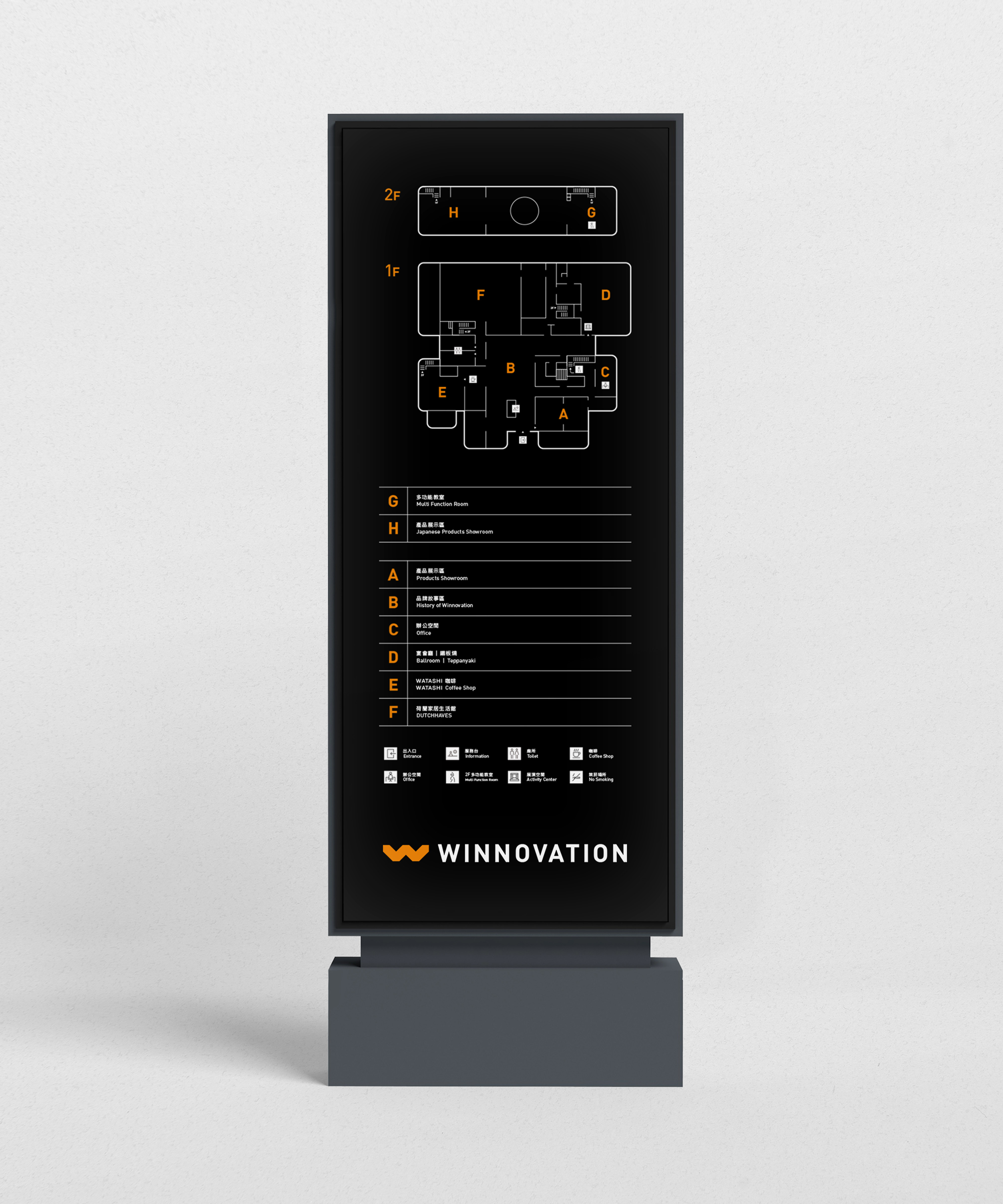
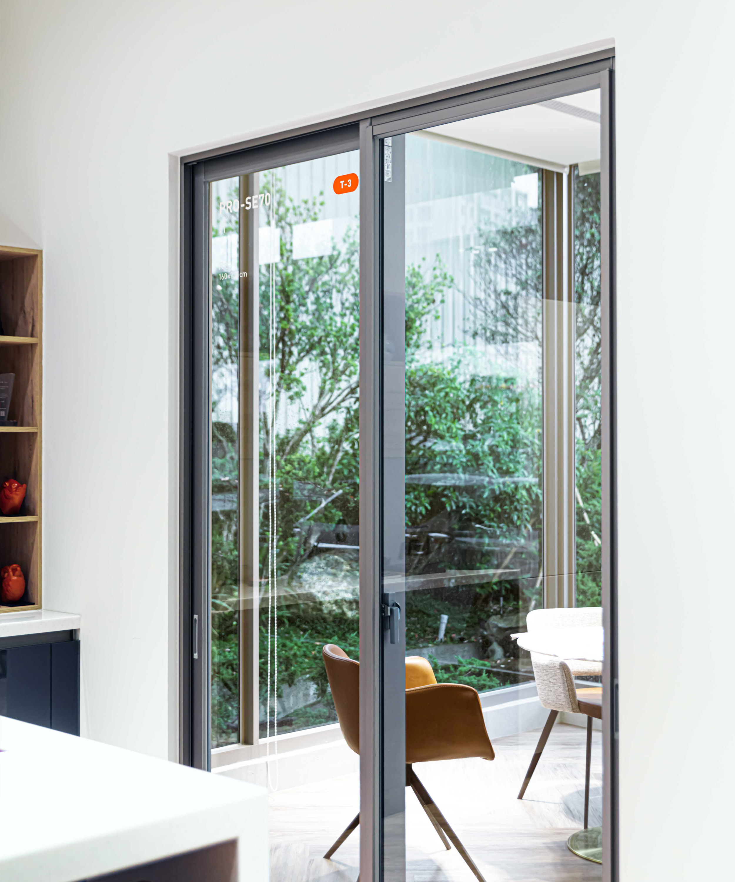
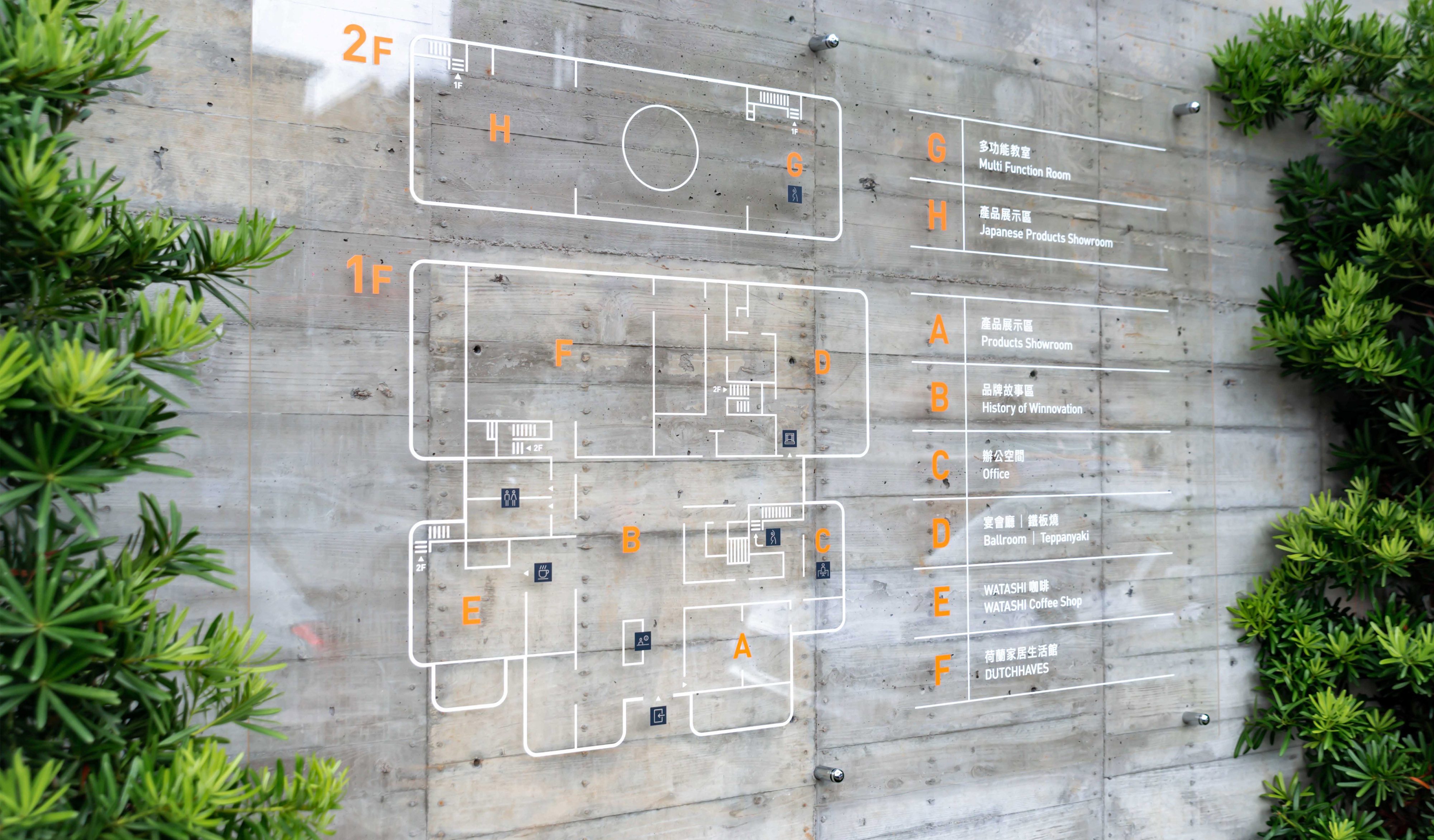
WINNOVATION is a Multifunctional Exhibition center located in Taichung North District. Its parent company is WIN Aluminum Co., Ltd., which has been involved in the aluminum door and window industry in Taiwan for more than 30 years. As progressive, WINNOVATION wants to provide customers with an on-site experience of diversified and functional product display and fulfill customer expectations. This center includes multi-function classrooms, ballroom, meeting room, and cooperates with cafe and teppanyaki brands to provide customers abundant in-person experience.
The naming of WINNOVATION was the combination between the company name “WIN” and the word “INNOVATION” as the connection to the high-quality brand services and diverse way of thinking to present a new lifestyle. The concept of brand identity comes from the relationship between craftsmanship and life, taking from the representative letter “W” combining it with a playful and creative geometric structure to show the new possibilities. This concept extends the six exclusive key visual designs composed of the brand spirit of “innovation, iconic, cross-domain, fun, technology, and youthfulness” and apply them to various productions.
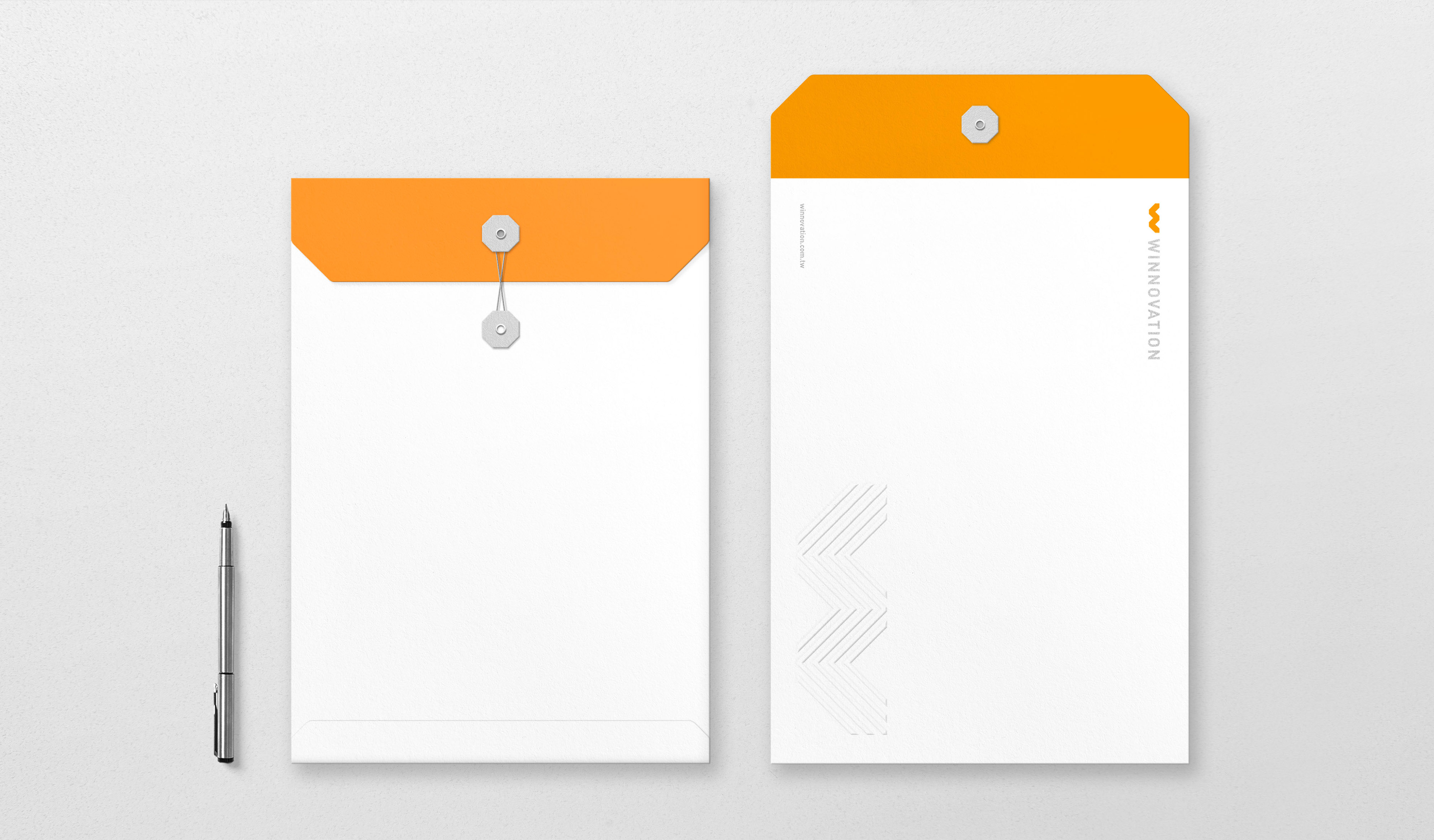
The brand color selection is referring back to the parent company WIN Aluminum Co., Ltd. The WINNOVATION Silver connects to the color of aluminum doors and windows, combining with WINNOVATION Orange to create a color system for WINNOVATION. The overall design follows the systematic brand visual language to pass down the idea of innovative craftsmanship.
WINNOVATION 多功能展示中心座落台中北區,其母體企業為台灣鋁門窗產業深耕三十餘年的勝群金屬股份有限公司。WINNOVATION 為追求與時俱進,期望提供顧客親臨現場體驗具多元化與功能性的產品展示,滿足顧客對於產品理解和選配的具體想像,並與咖啡、鐵板燒品牌合作進駐展示中心,附有多功能教室、宴會廳、會議室等設施也提供來客更豐富的空間體驗。
品牌命名 WINNOVATION 結合勝群英文名 WIN (頂尖) 與 Innovation (創新),連結展示中心完善的品牌服務與現代的多樣思維,呈現嶄新的生活美學。識別概念以工藝與生活的連結為出發,取其代表性字母 ”W” 結合巧拼板富有創意、玩味特點的幾何結構,體現多元及創新的可能性,以此概念延伸「創新力、指標性、跨領域、趣味性、技術力、年輕化」六項由品牌精神構成的專屬主視覺設計 (Key Visual) 並應用於各項製作物上。
為與母體企業勝群金屬有所連結,在色彩規劃上通過重新定義 WINNOVATION Orange 標準色,並擷取鋁製門窗產品特色衍生的 WINNOVATION Silver 輔助色搭配構成色彩系統,串連勝群金屬與 WINNOVATION 之間的品牌關係。在各項製作物設計時除了導入主視覺與色彩系統之外,在設計中所使用的幾何造型皆以標誌 (Symbol) 製圖結構為基礎,通過系統化的視覺符號貫穿應用系統並傳遞 WINNOVATION 強調創新工藝的概念訴求。
T Branding Y 2019 CD Chi Tai Lin AD Yu Chien Lin D Chi Tai Lin, Wun Siang Huang PM Yu Chien Lin C WIN Aluminium Co., Ltd.


Related Projects
![]()
![]()
![]()

© 2015 — 2026 不毛 nomo®creative