RUFOUS Coffee Roasters
branding
Established in 2007, RUFOUS Coffee Roasters has over ten years of experience in coffee roasting and brewing, it makes RUFOUS an iconic brand in Taiwan. Meanwhile, their partners are still focusing on new skills and improving the products. Their Homemade Roasting Beans was highly rated by Coffee Review, a leading platform of coffee industry.
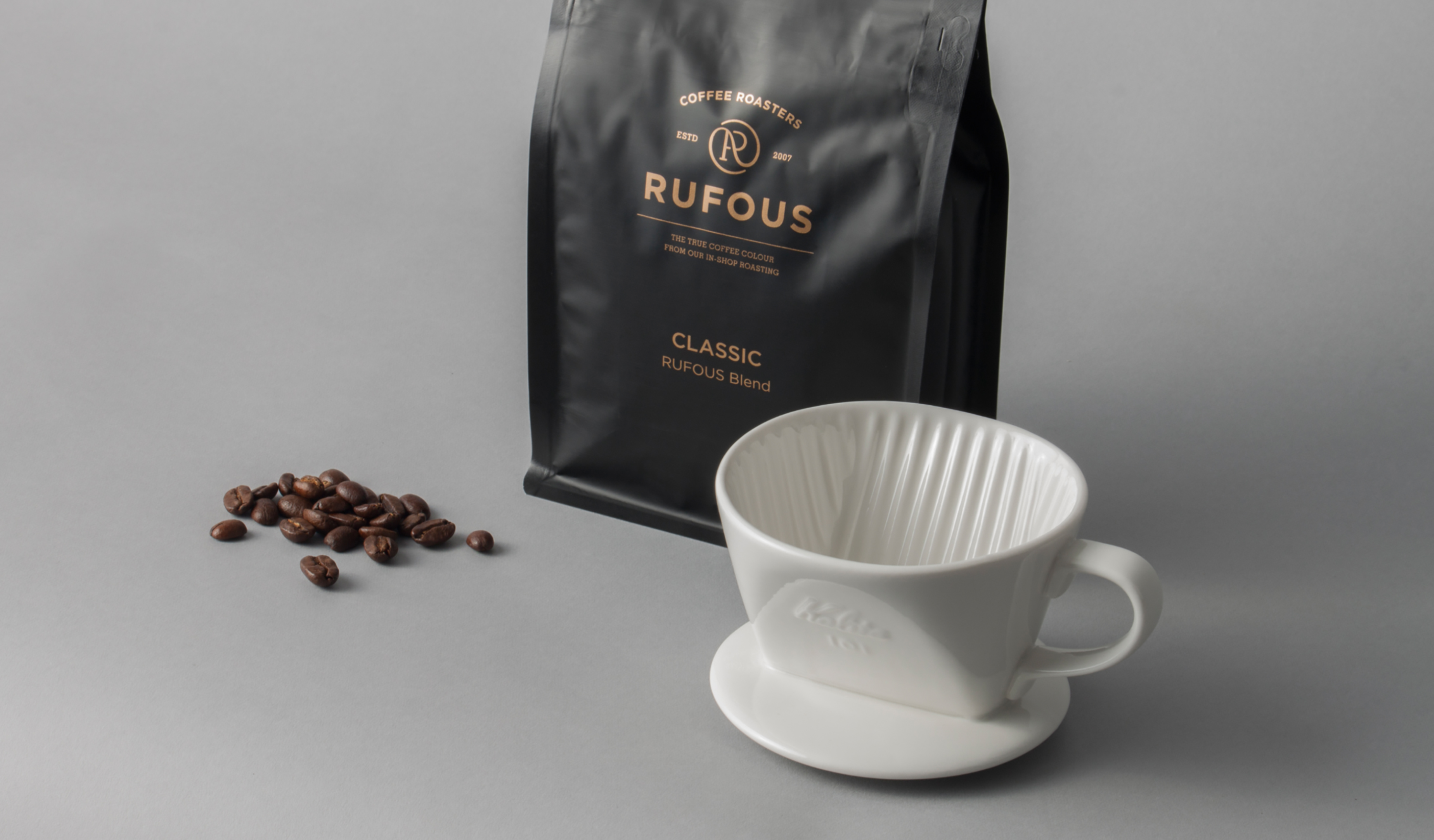
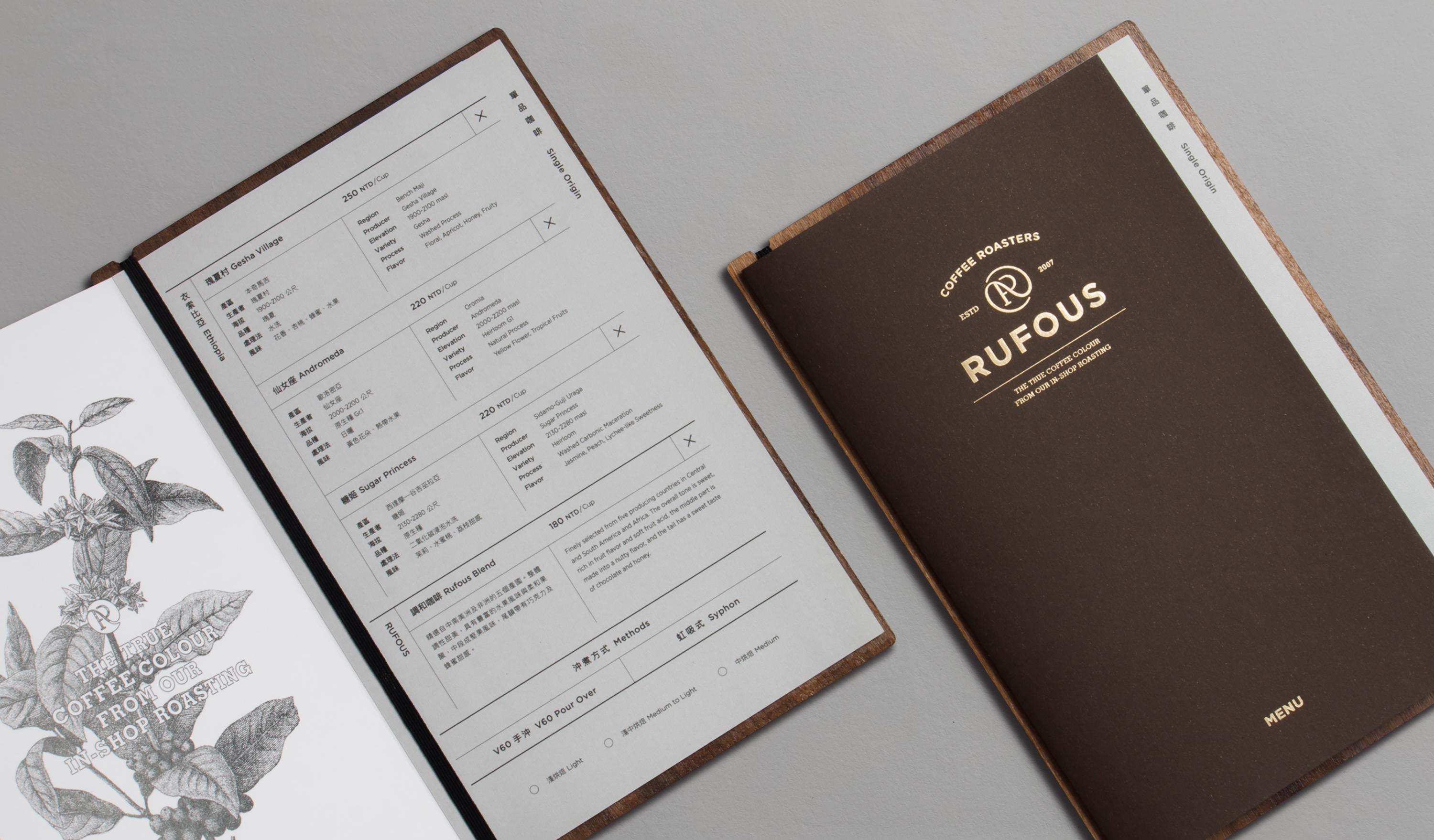
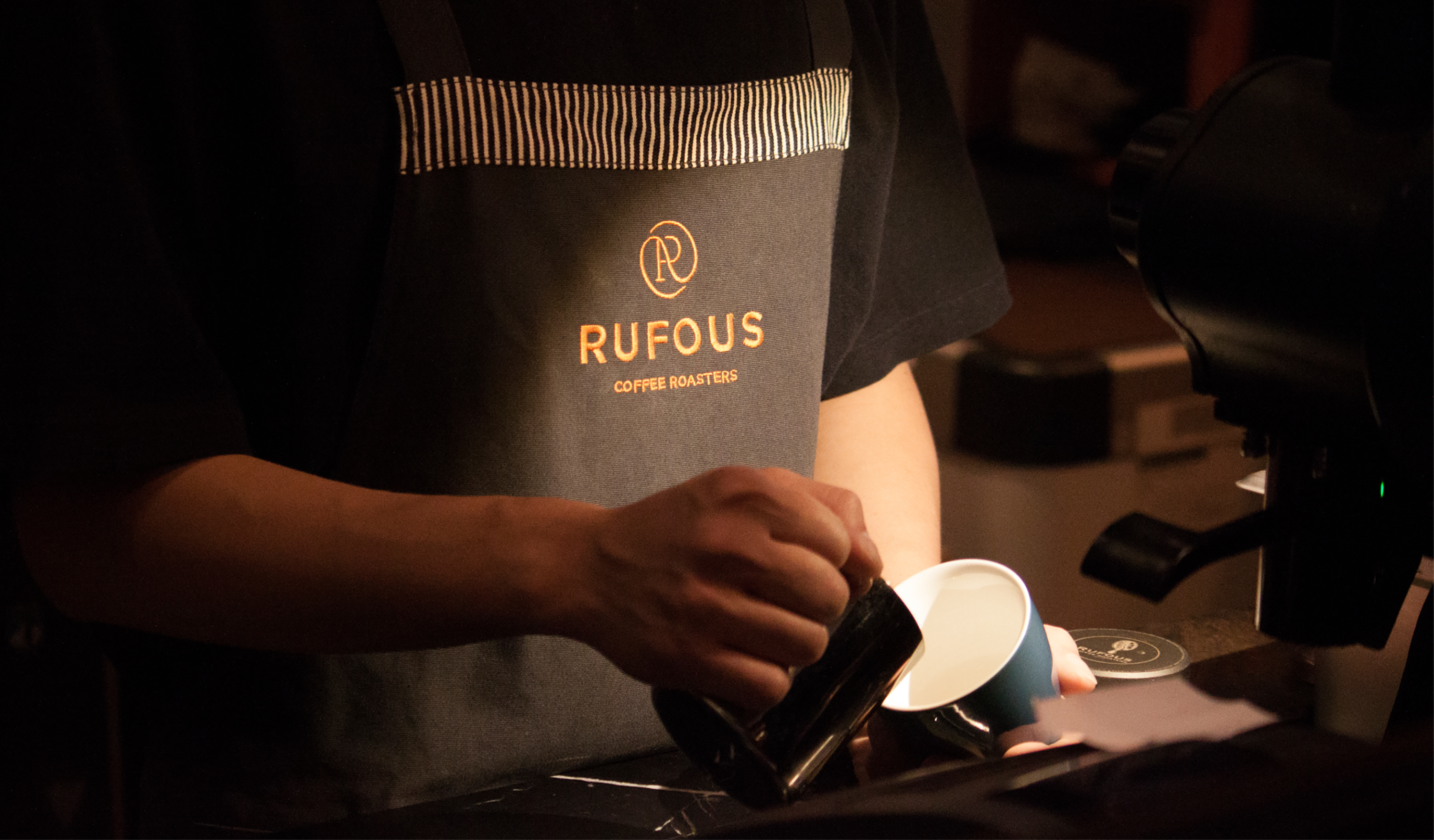
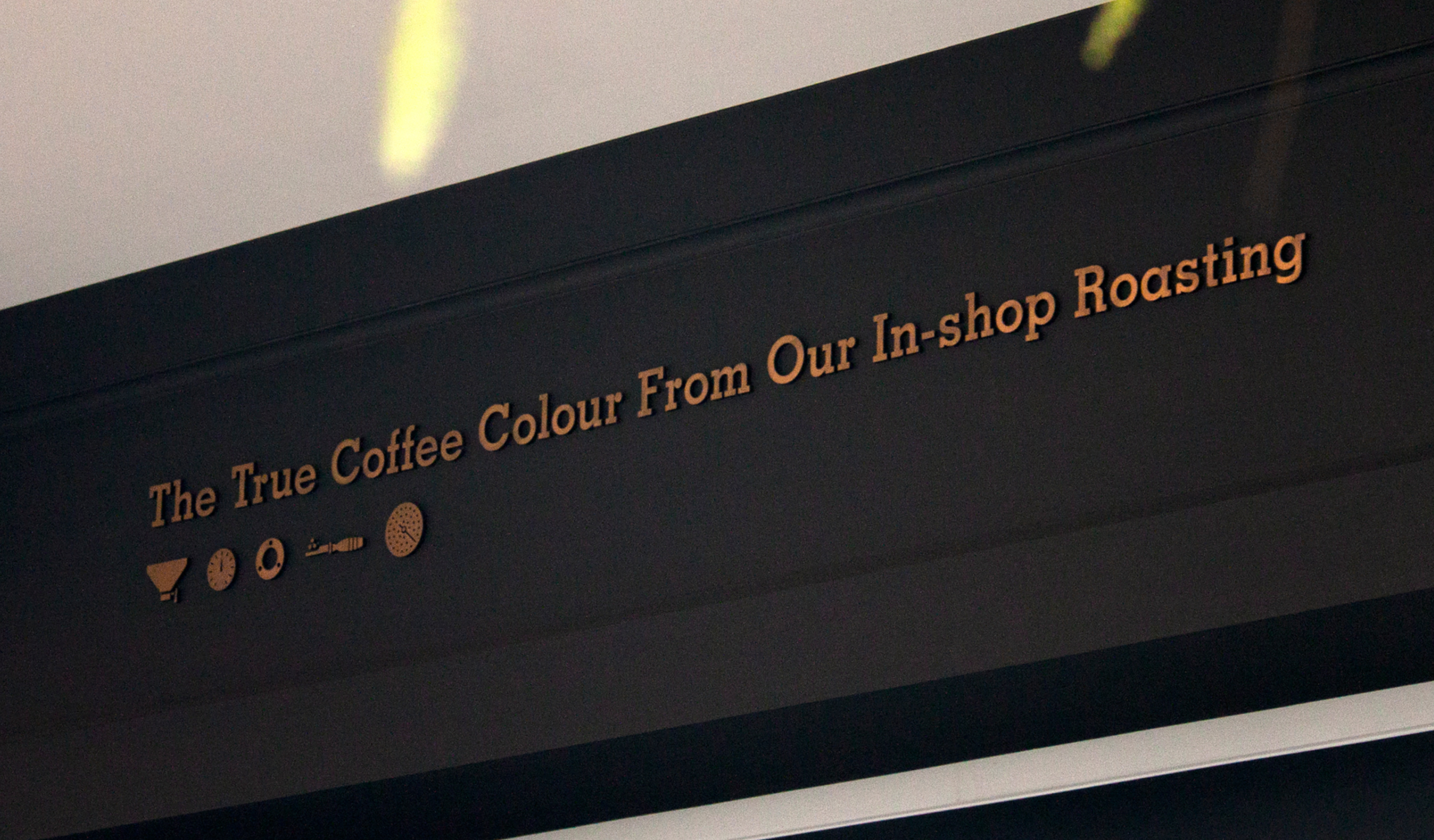
For the new brand identity of next decade, designers reviewed RUFOUS’s story, core values, and the current identity then. There’re two main tasks of design team: bringing fresh look to regulars and keeping old logo’s characteristics. The designers use circular shape to express the process of roasting. ”The True Coffee Colour From Our In-Shop Roasting.” their barista says.
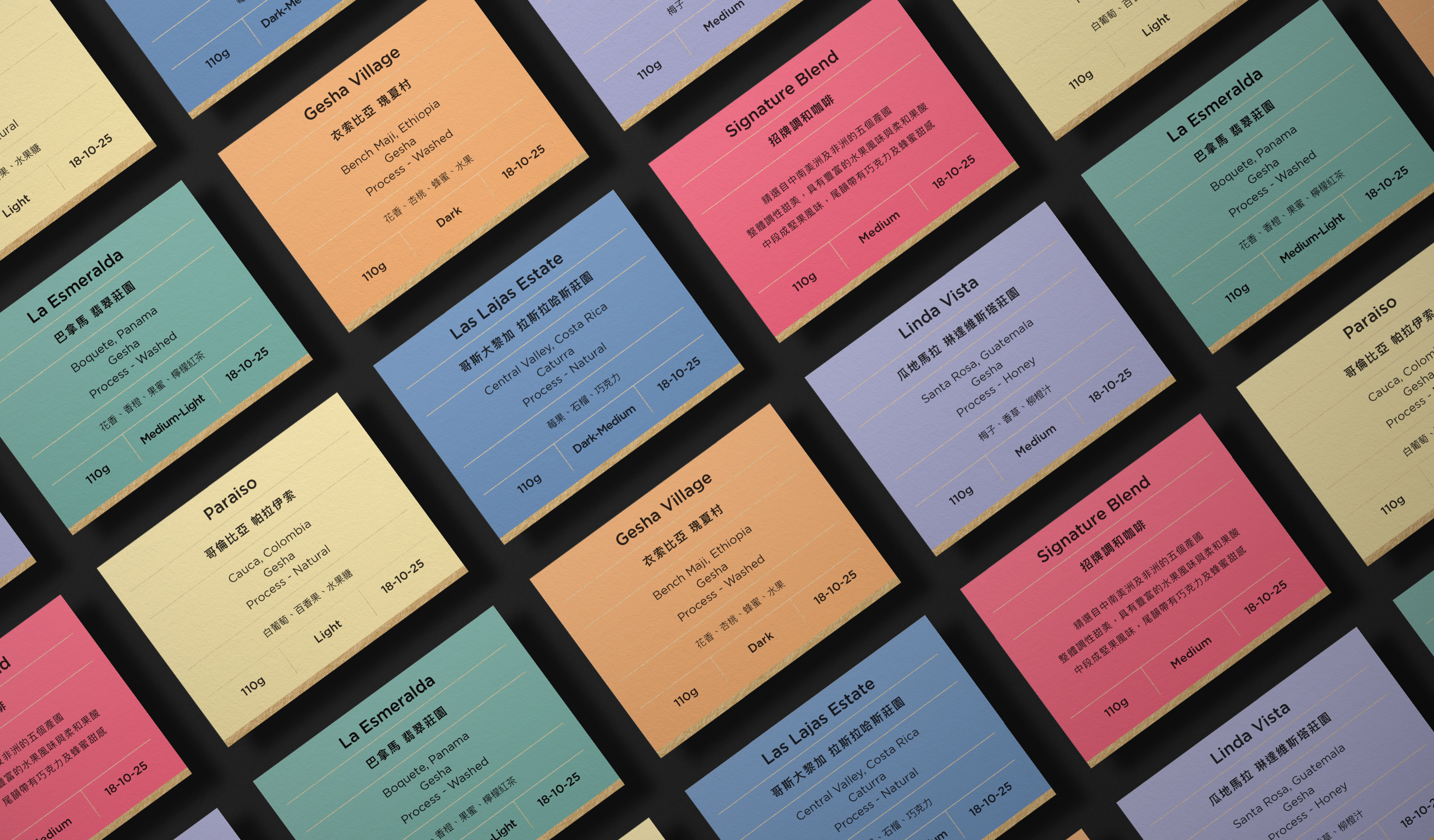
RUFOUS has two shops in Taipei, but their vibes are so different. In this new identity, designers applied different color themes for each one, and for different products, each one has their own visual appearances, and all under the same brand tonality.
RUFOUS Coffee Roasters 成立自 2007 年,專研十年以上咖啡烘豆和沖煮經驗讓 RUFOUS 成為台灣極具指標性的咖啡品牌,至今仍是咖啡愛好者心中必訪的名店之一,自家烘焙的咖啡豆也曾獲得權威平台 Coffee Review 高分評價,持續專研、實驗並開發出創新咖啡是 RUFOUS 的初衷也是品牌的核心精神。
在 RUFOUS 的新識別發想時,我們首先確立了品牌累積至今的優勢以及核心價值,在考慮和現有識別的銜接與形象塑造上,如何讓常客耳目一新的同時也能夠保留記憶中的輪廓,是我們在概念發想時的關鍵任務之一。在標誌中我們取樣咖啡烘豆時滾動的動態視覺,將此意象帶入識別概念,讓專研烘豆和沖煮的精神融入標誌之中,如同 RUFOUS 的品牌標語 ”The True Coffee Colour From Our In-Shop Roasting.” 充分表現出對於專業不妥協和自我要求的精神,也和常年飄散著咖啡氣味的店內溫暖氛圍有所呼應。
RUFOUS 設點在台北市的兩家實體店面擁有截然不同的個性及氛圍,在全新的識別中,我們分別給予兩家店設定了各自的色彩規劃,同時也針對咖啡豆的風味訂定了專屬的色彩系統,讓秉持著相同精神的 RUFOUS 擁有各自不同的風格面貌。
T Branding Y 2018 CD Yu Chien Lin AD Chi Tai Lin D Yu Chien Lin, Wun Siang Huang, Chi Tai Lin PM Yu Chien Lin PH Wun Siang Huang C RUFOUS Coffee Roasters










© 2015 — 2026 不毛 nomo®creative
