

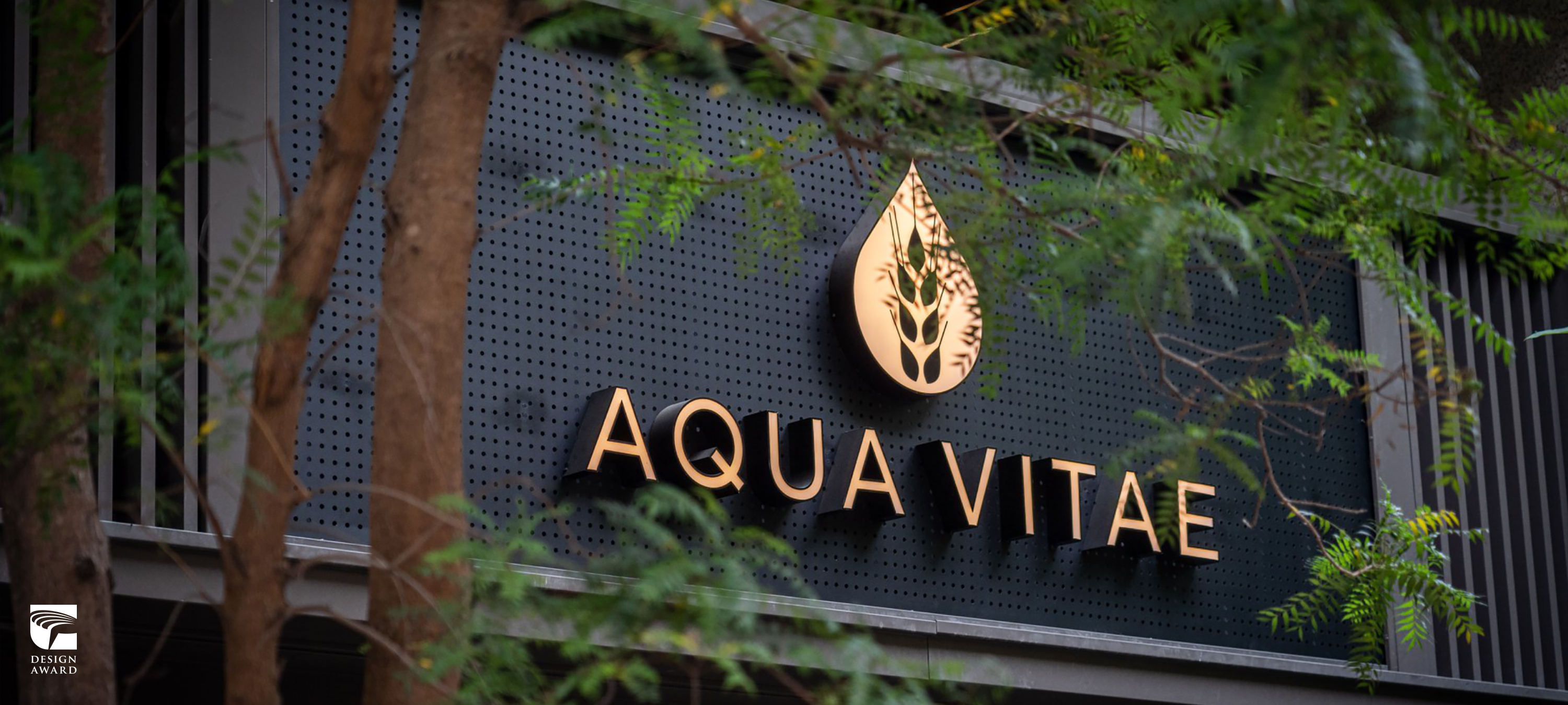
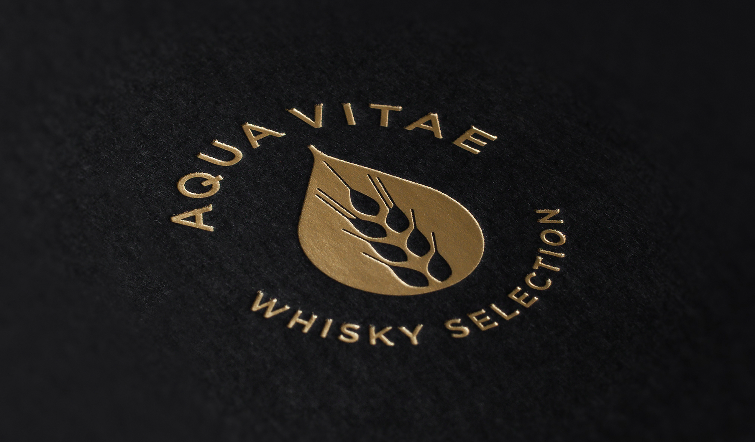
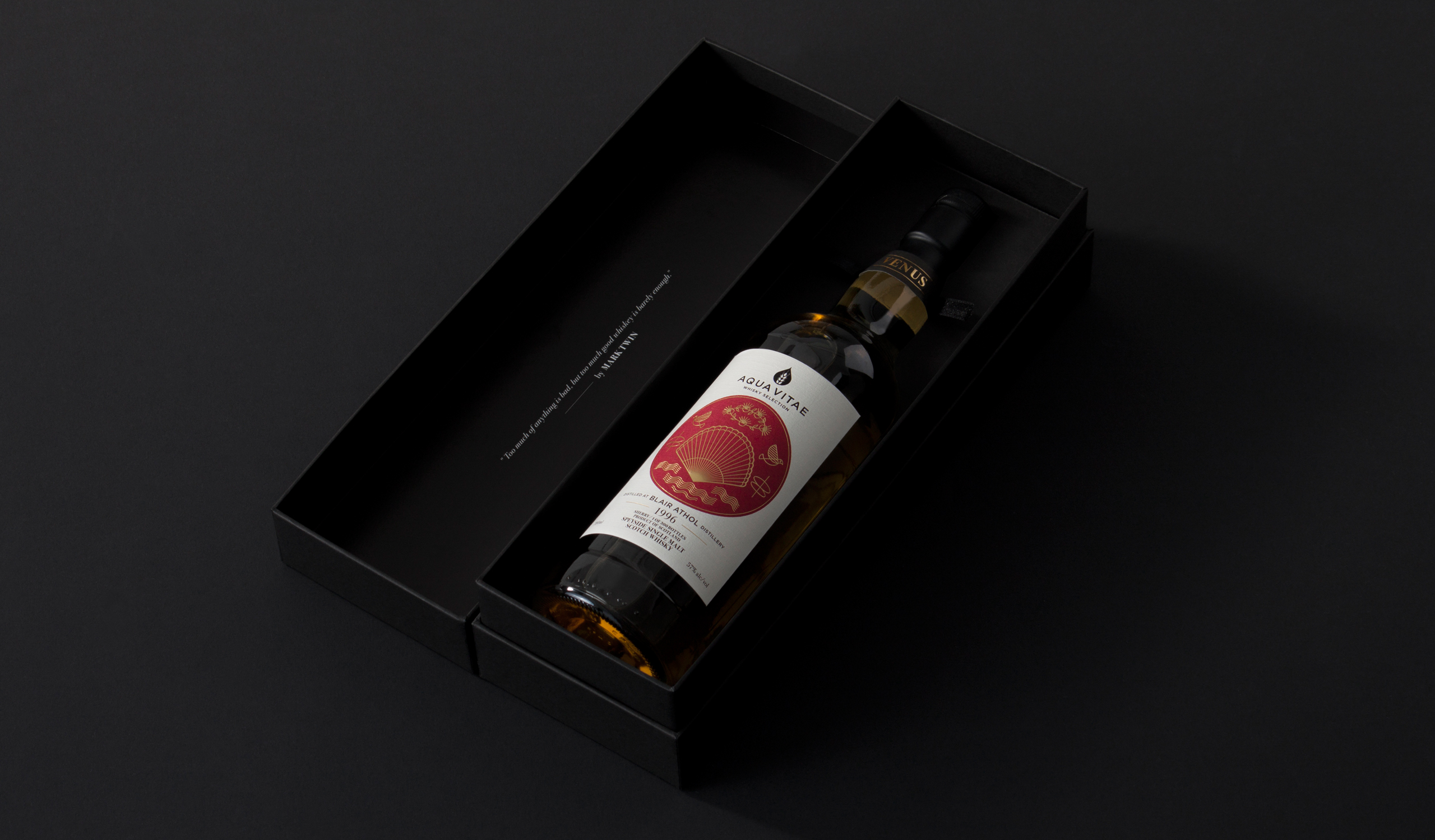
AQUA VITAE is an independent bottler with special tastes and perspectives for whisky. In the Latin, AQUA VITAE means “water of life”, so AQUA VITAE is running with that concept to keep bottling excellent whiskies.
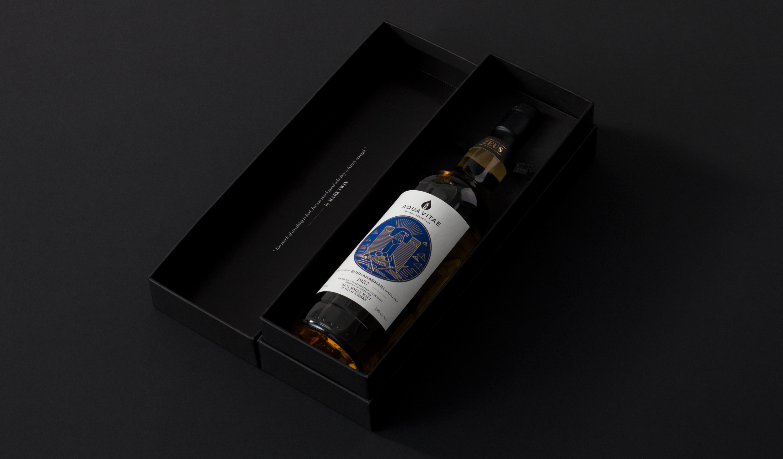
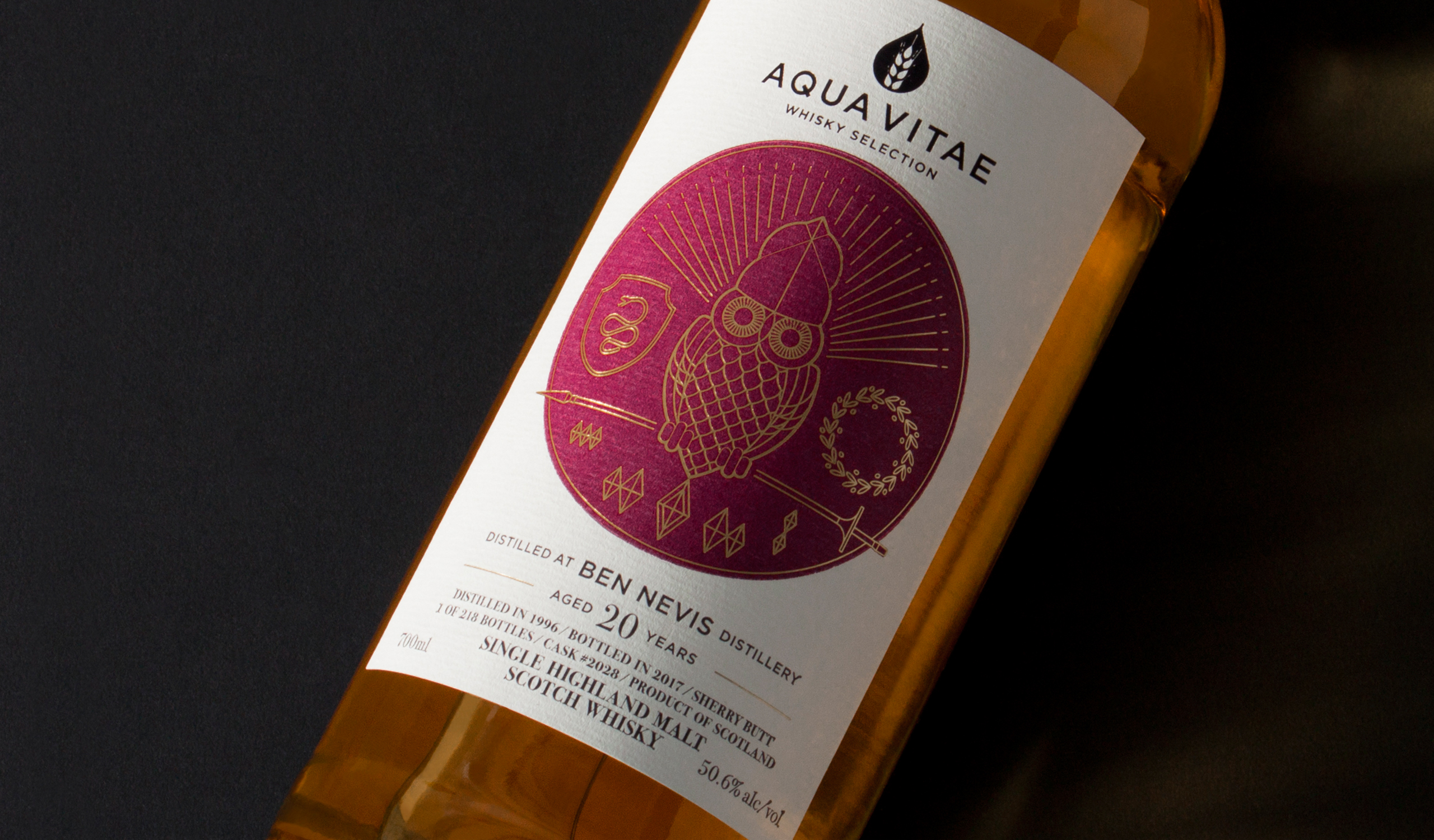
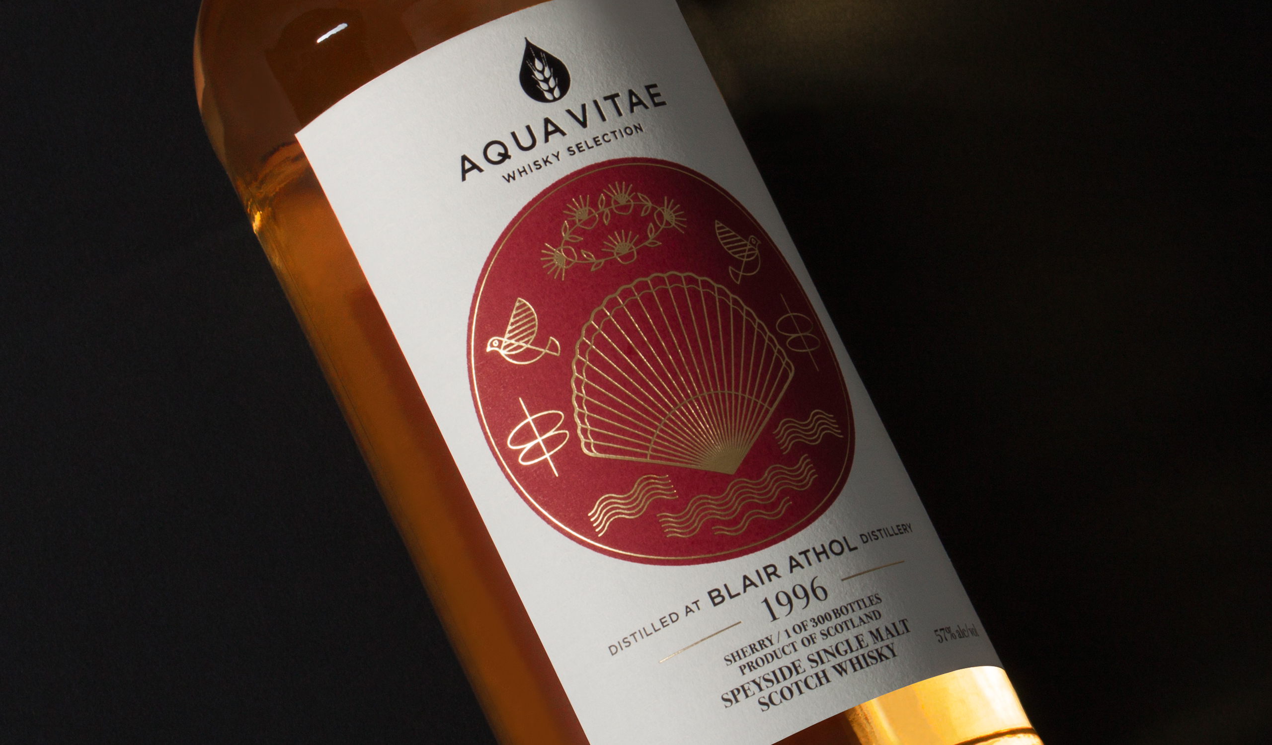
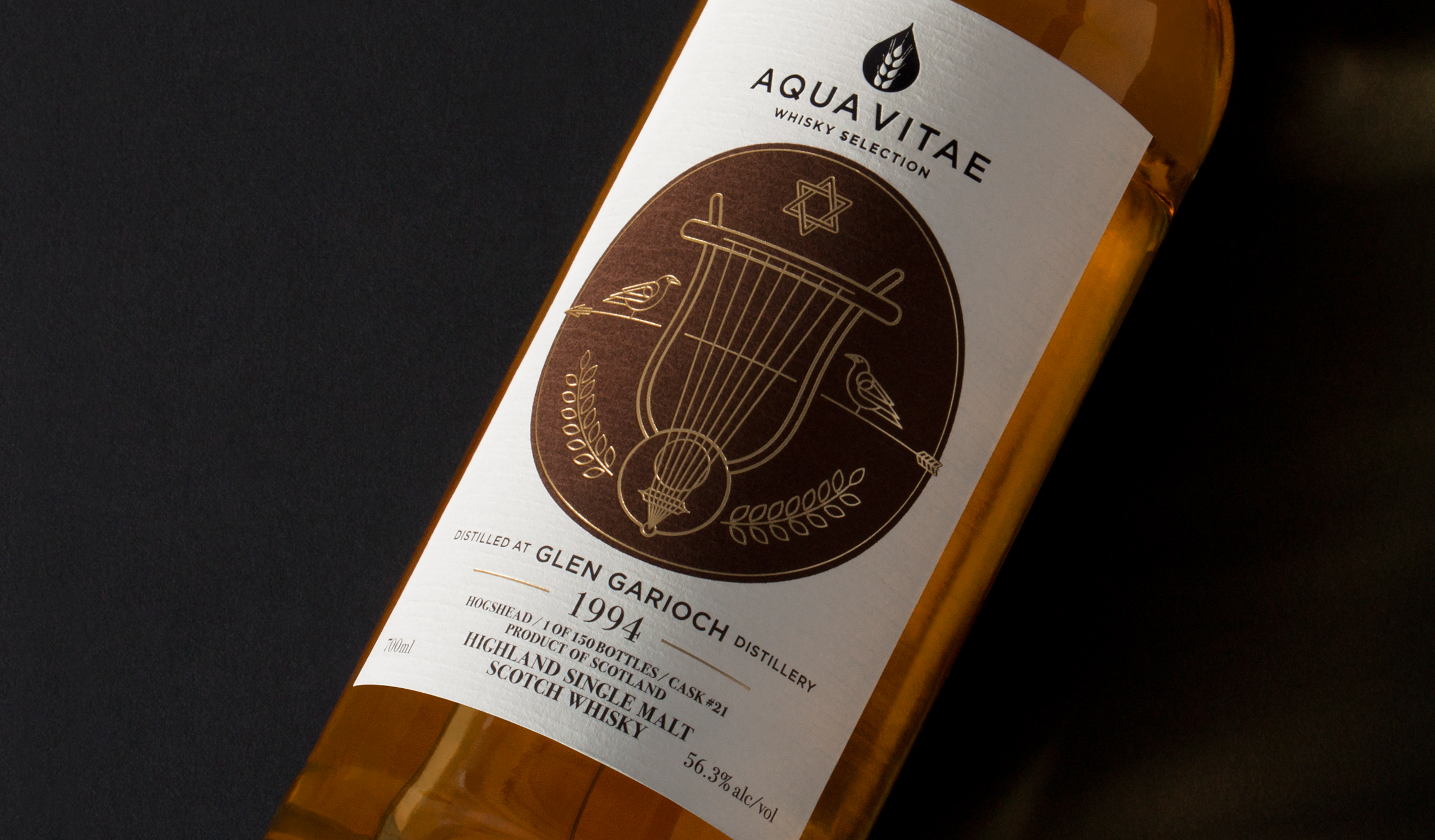
Fallowing the main concept we create an brand new identity carries simple and classic character into all the applications. Especially we picked up the drop and wheat as key elements to communicate it’s purely refine and richly tasty. And we also recreated the immortal Greek mythology with five new visuals as the first series for AQUA VITAE.
AQUA VITAE 是創立於台灣的 IB 威士忌品牌,AQUA VITAE 在拉丁文中意指「生命之水」。標誌象徵著穀物經過蒸餾後所萃取出來的精髓,如體內對威士忌有著獨特品味的靈魂,而靈魂正是生命的本質。
基於市場考量我們設定了 ”希臘神話” 作為包裝系列主題和品牌意念呼應,在視覺呈現上為避免被原有角色刻板印象影響,我們取樣角色代表性的各式符號構成視覺主體,將擁有不同風味的威士忌塑造成來自不同背景和性格的神話角色。
T Branding, Packaging Y 2017 CD Chi Tai Lin AD Yu Chien Lin D Chi Tai Lin, Wun Siang Huang PM Chi Tai Lin PH Wun Siang Huang (Identity, Packaging) C AQUA VITAE


Related Projects

© 2015 — 2026 不毛 nomo®creative