

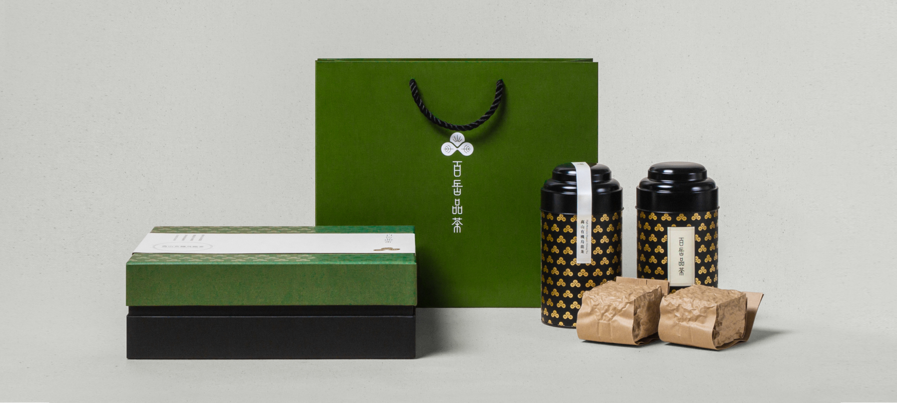
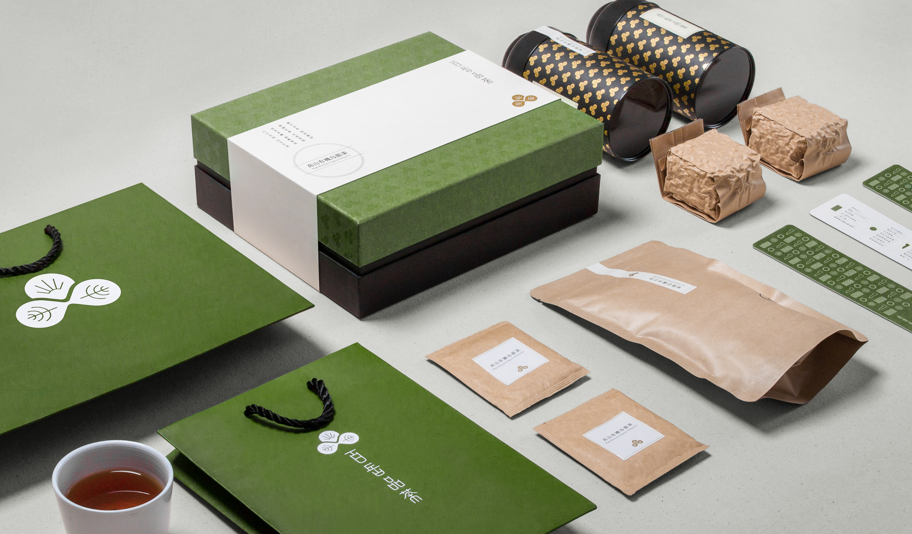
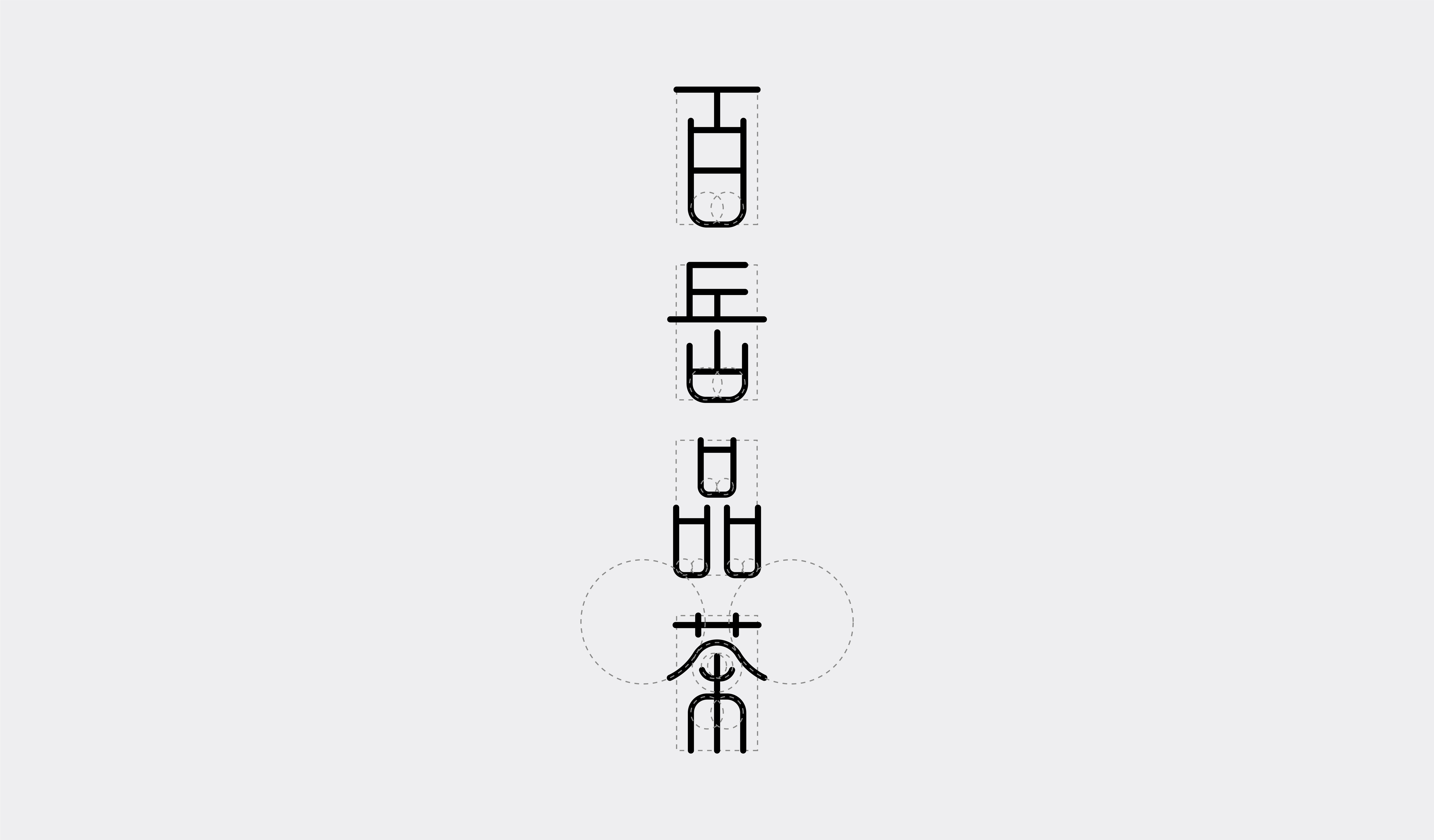
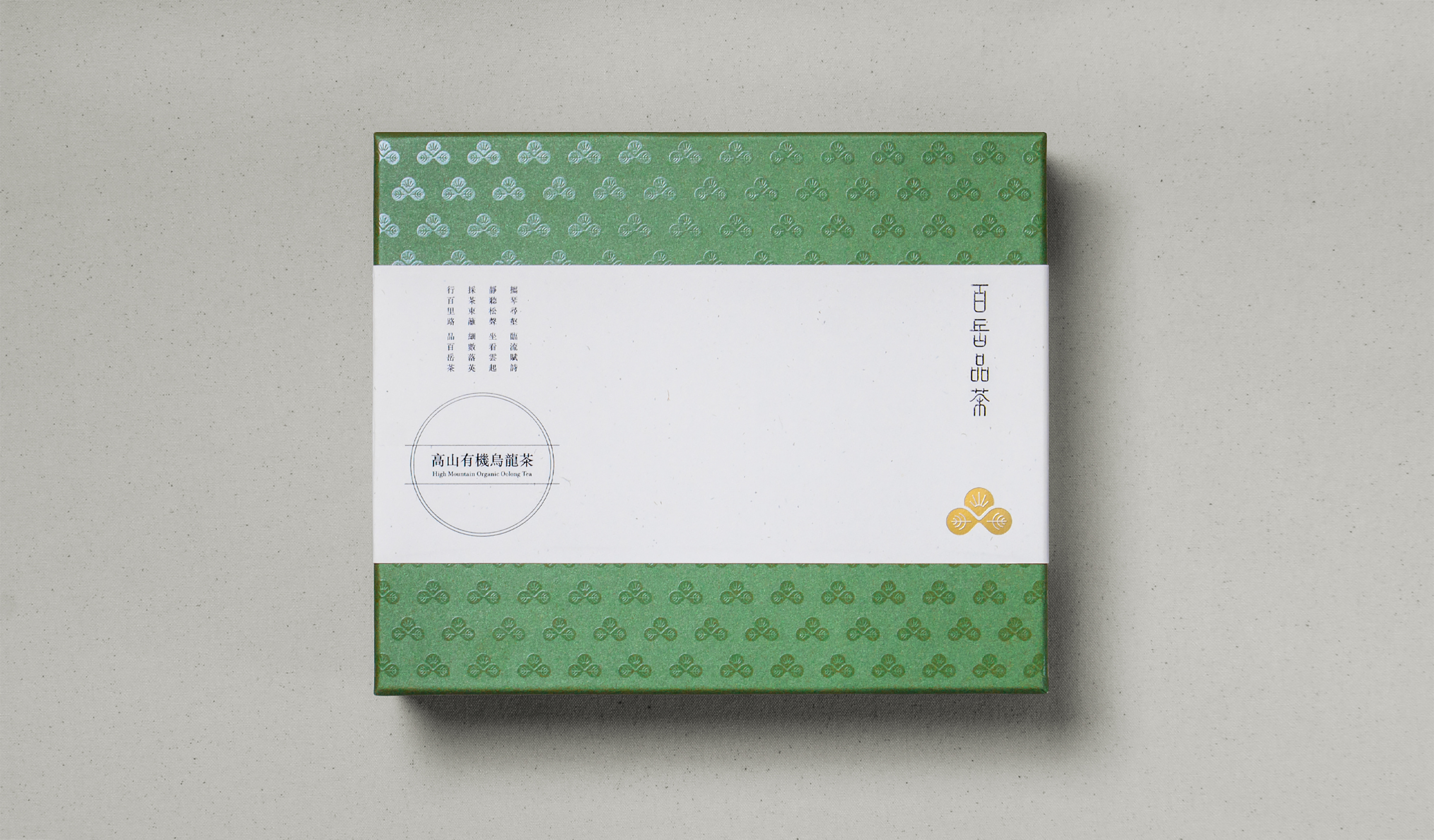
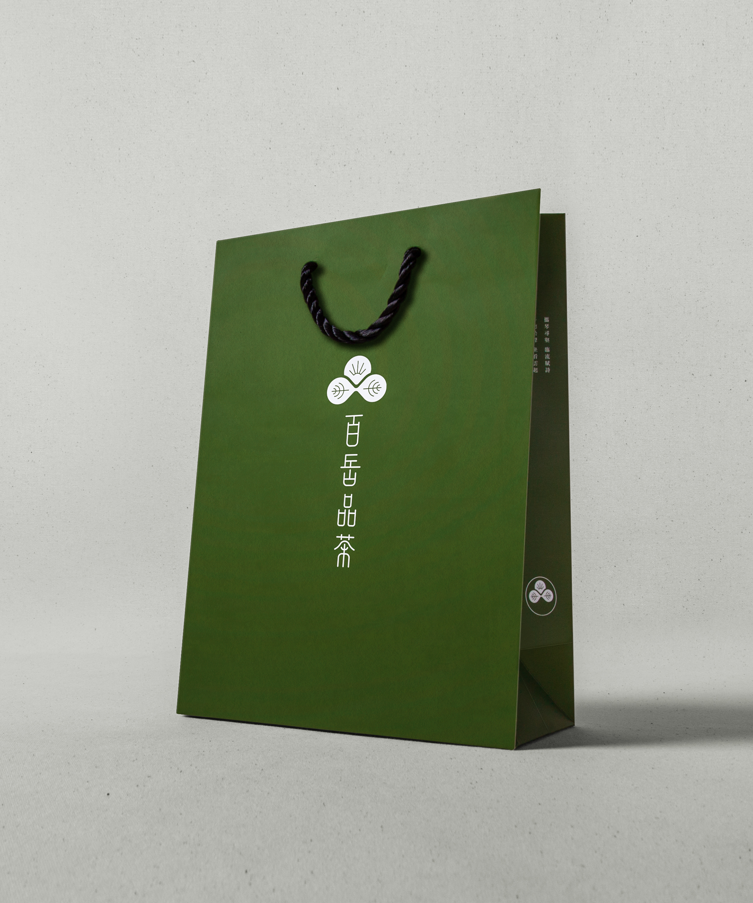
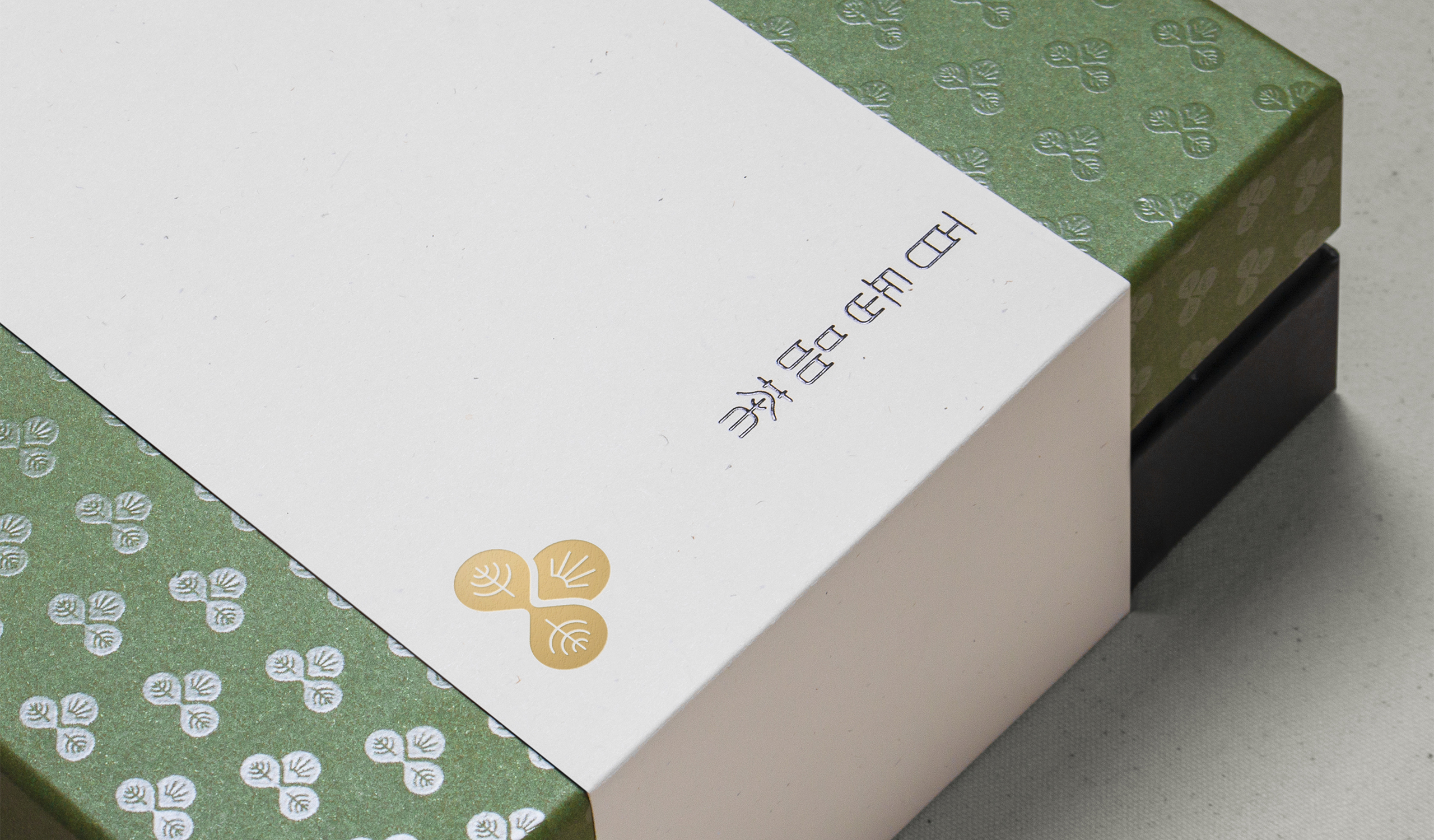
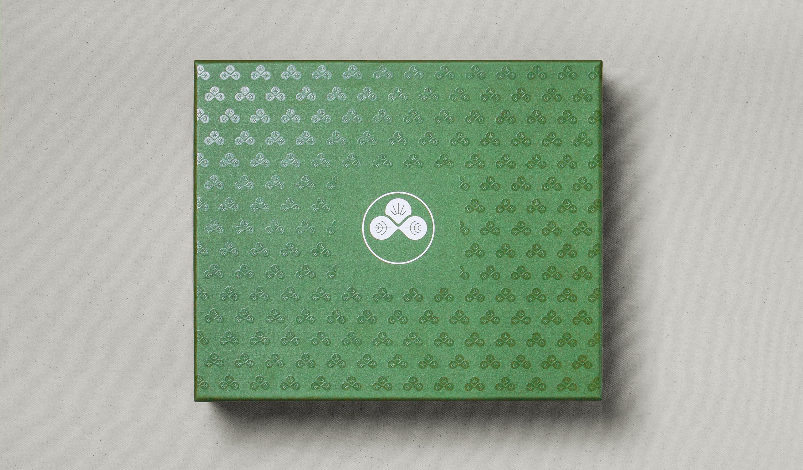
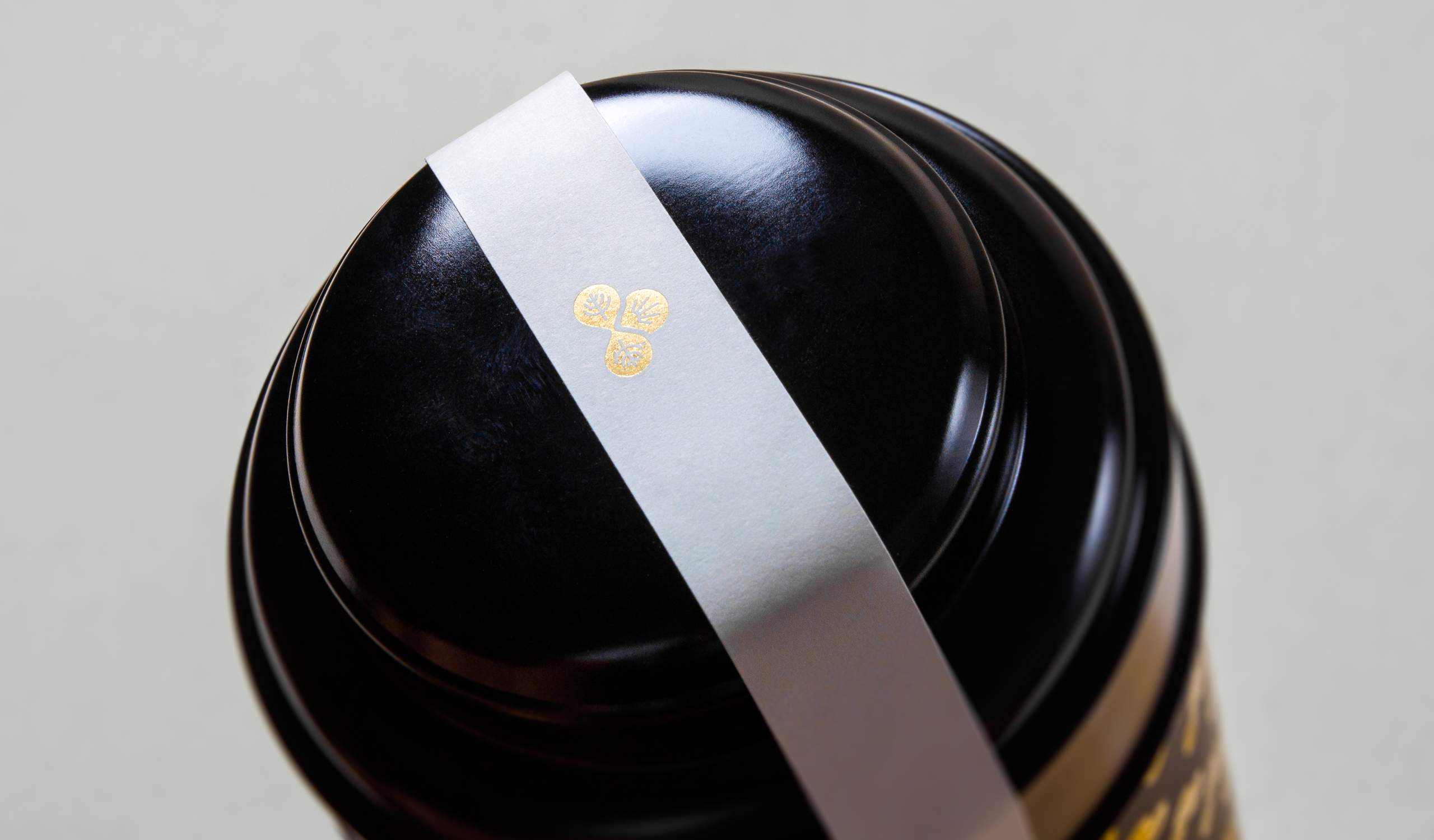
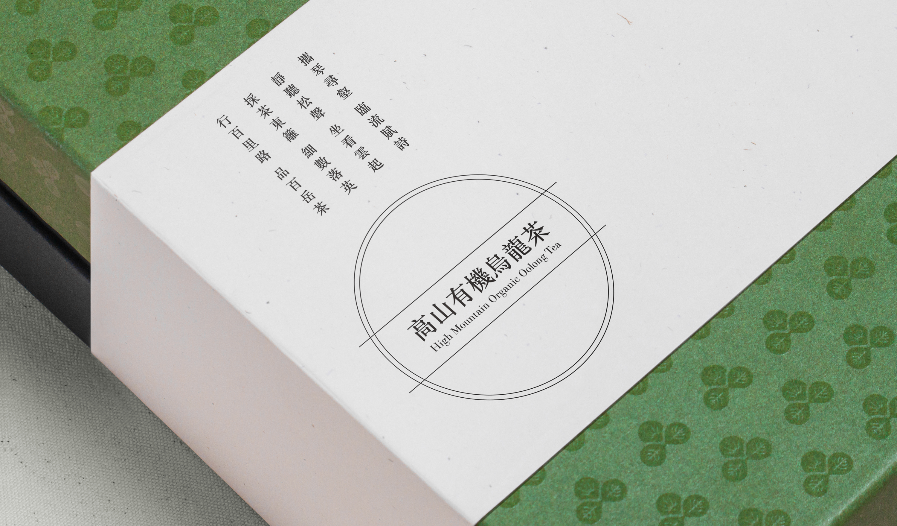
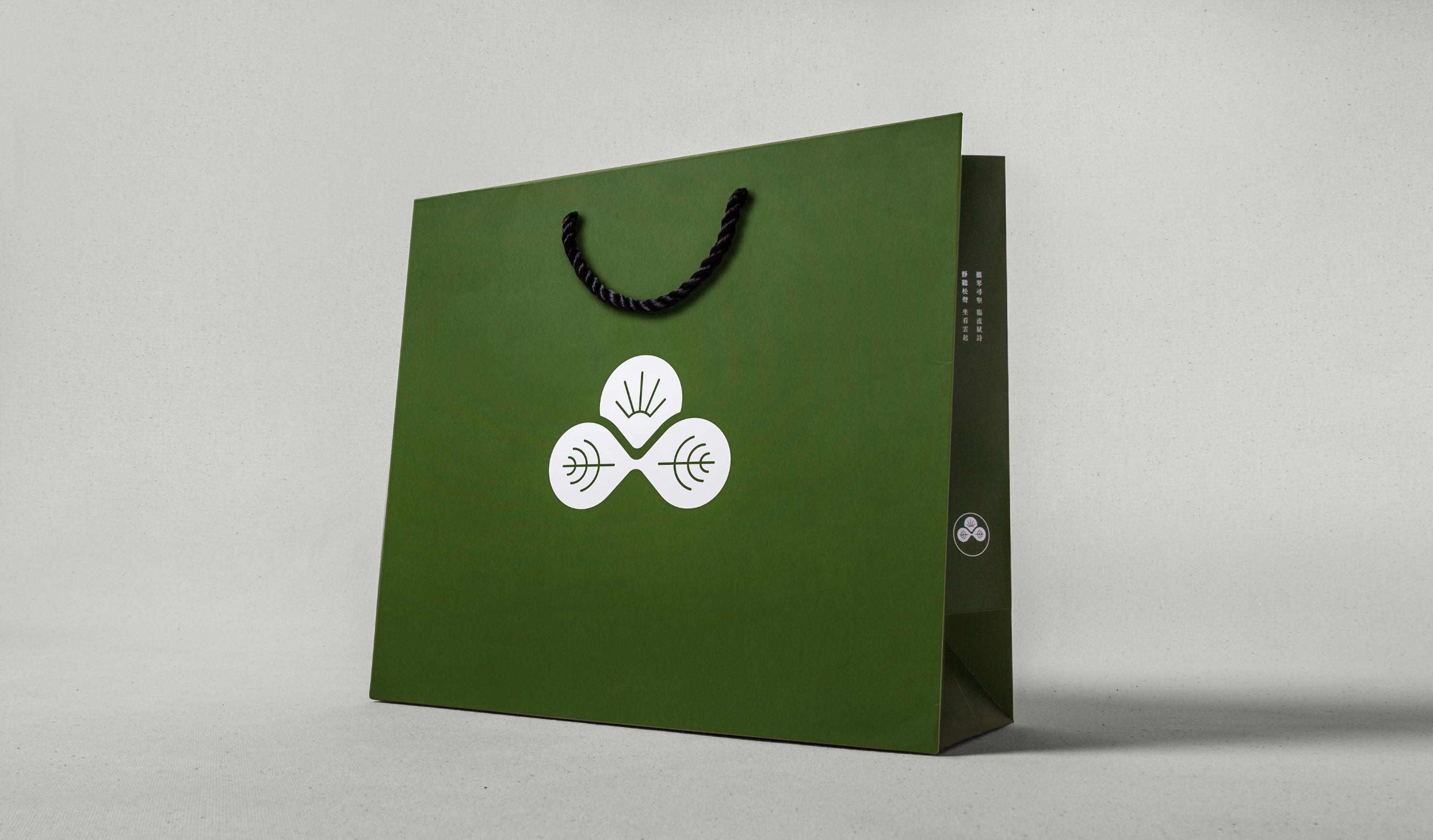
The logo is basically inspired and structured by Chinese character “PIN” (品) which means tasting. BAIYUE TEA focus on producing hight quality high-mountain tea, the logo combines three key elements, leafs, sun and mountain, to image the mood of being in the mountain and tasting the high-mountain tea.
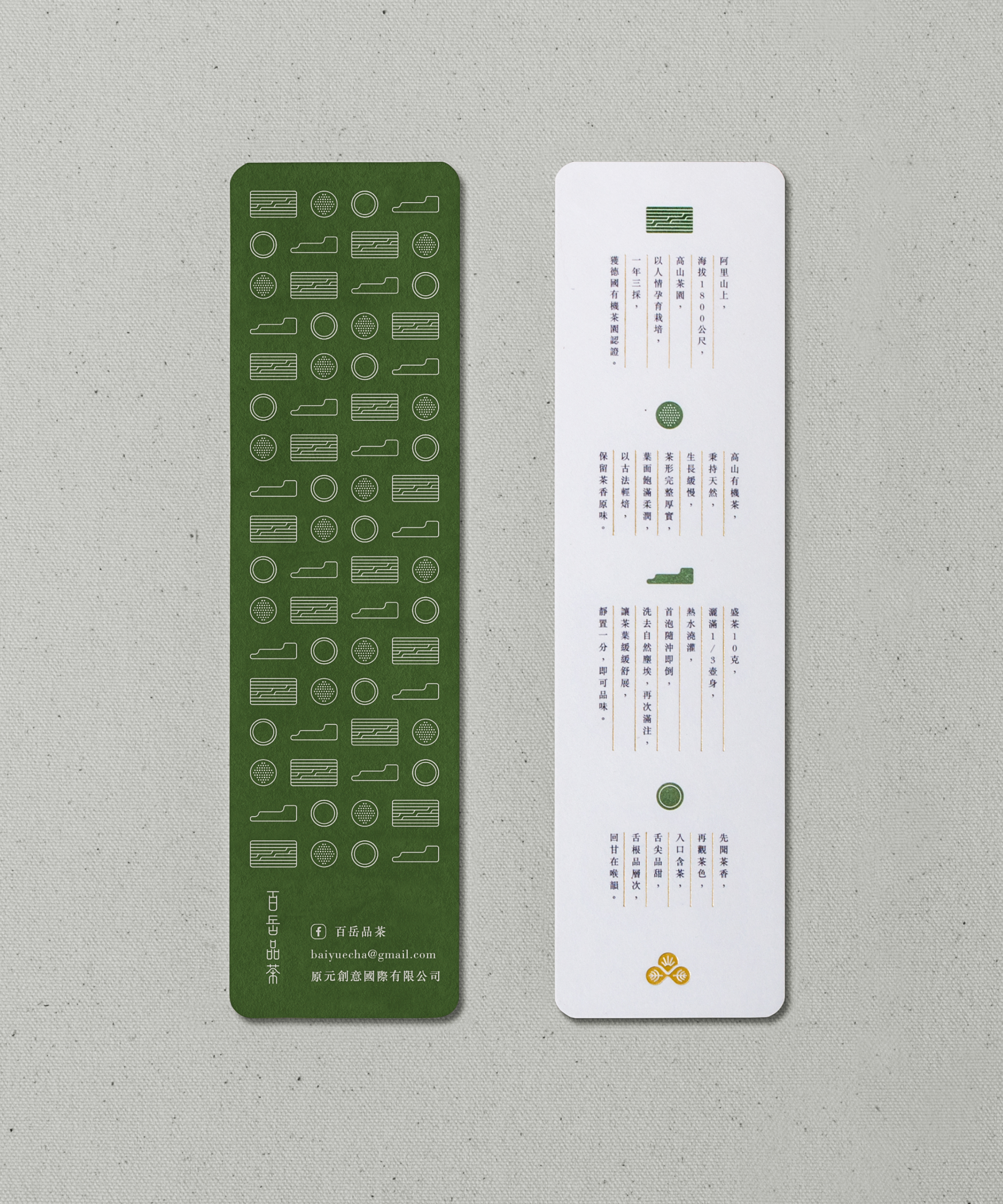
標誌取「品」字作為視覺結構,融入了旭日及茶葉元素,並以中央的山陵線勾勒出日出意象。葉脈則暗喻兩只茶杯對飲情境,以此概念塑造品嚐百岳茶的視覺意境,也帶出百岳品茶以高山茶種為特色主打。
T Branding, Packaging Y 2017 AD Chi Tai Lin D Chi Tai Lin, Yu Chien Lin DA Wun Siang Huang PM Chi Tai Lin PH Wun Siang Huang C BAIYUE TEA
Related Projects

© 2015 — 2026 不毛 nomo®creative