


Chillin’ Day
日秋紅白調飲
branding
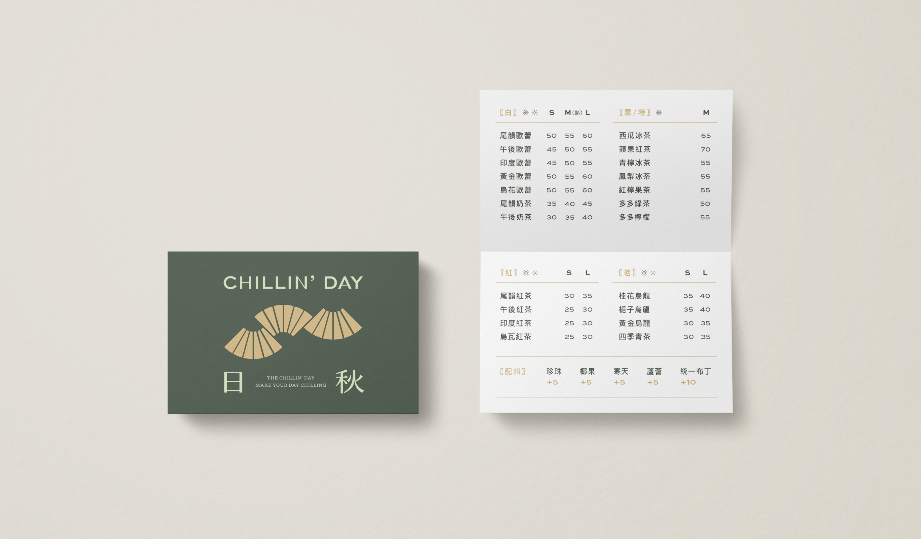
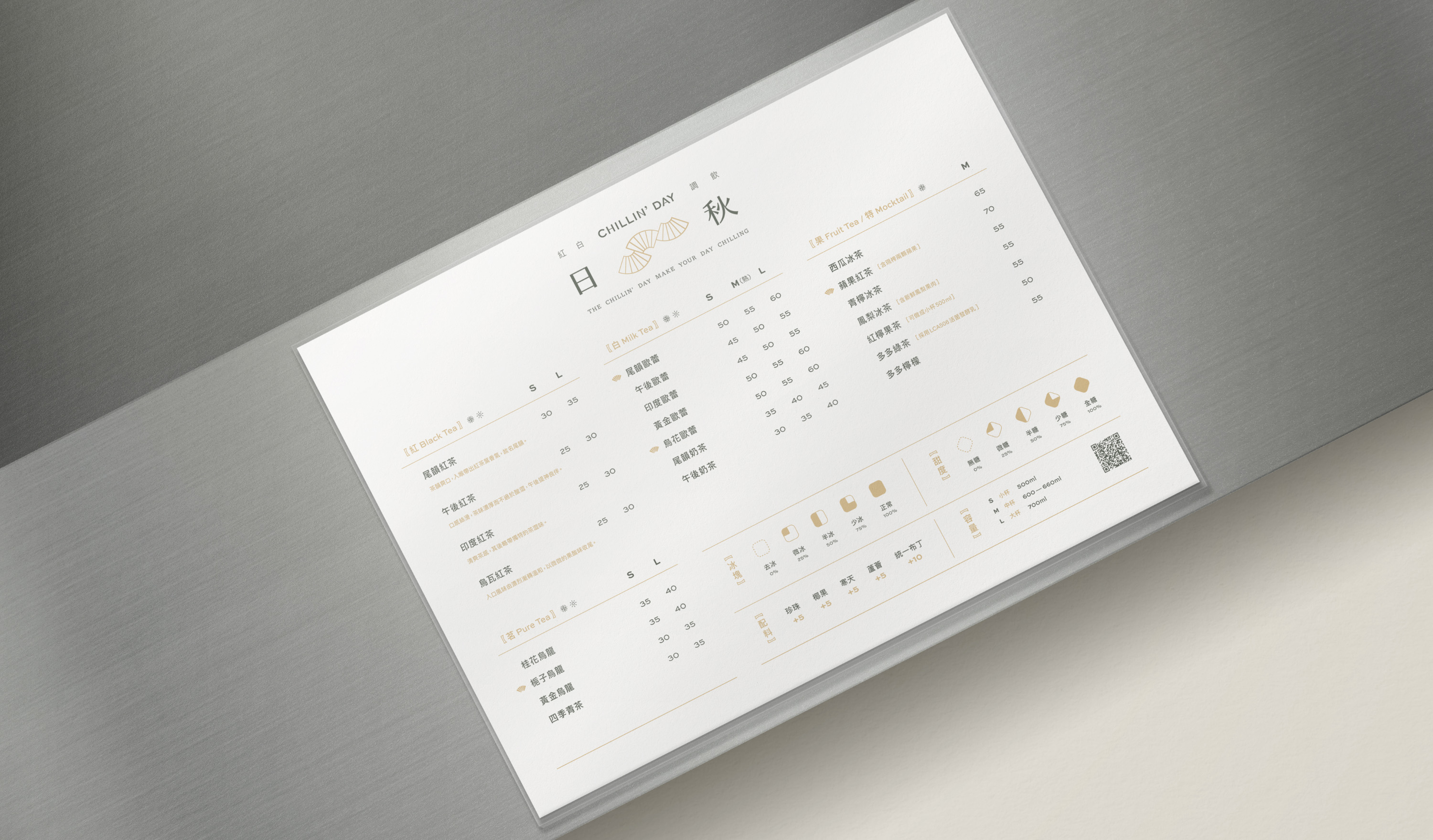
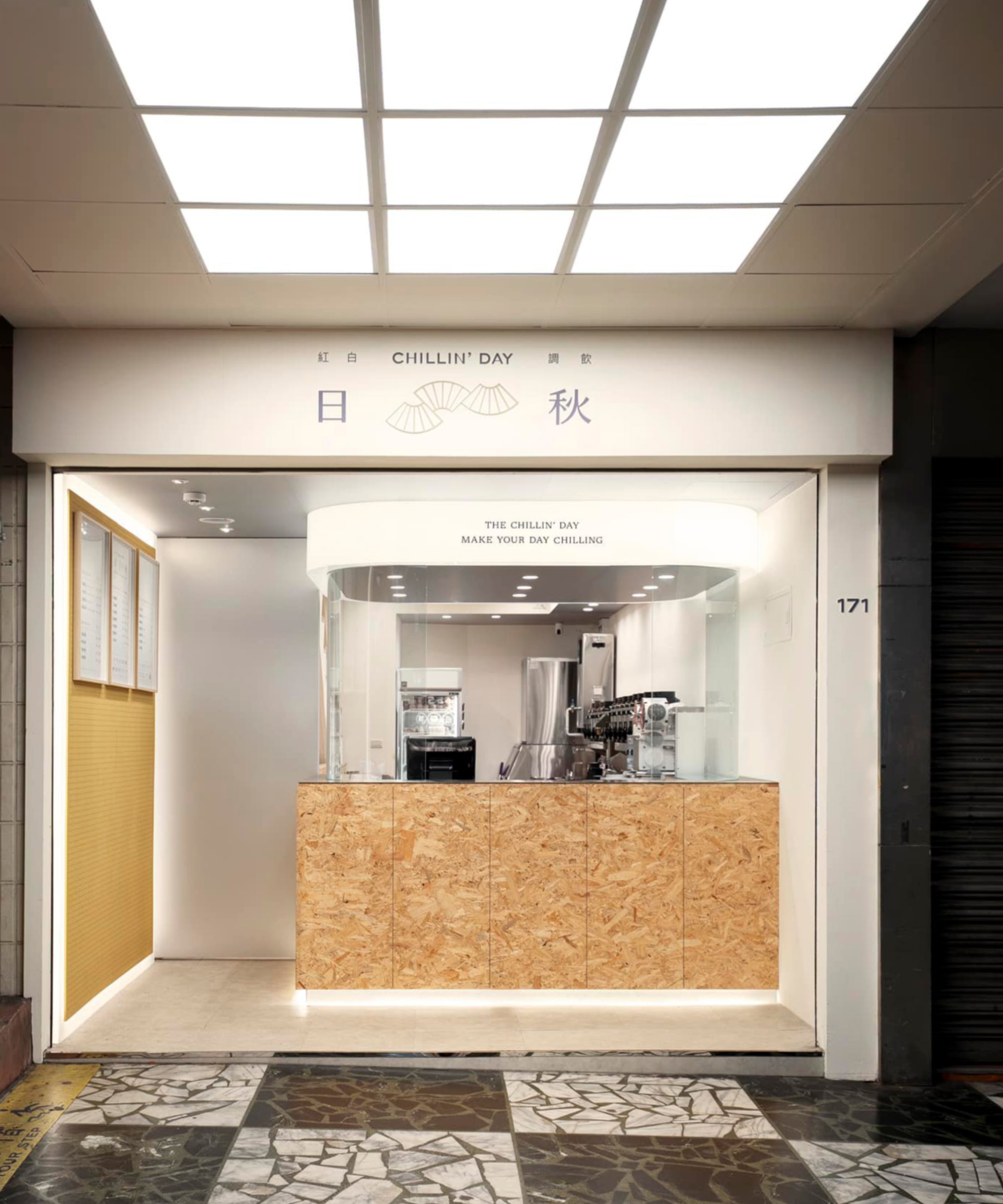
The first store of the “CHILLIN’ DAY” milk tea shop is in Donghu, Taipei. The brand name “CHILLN’ DAY” expresses the brand spirit, with is close to everyday life and provides a relaxing experience. Use a variety of tea and raw materials as based creates delicate and healthy specialty drinks. They hope to offer the local customers high-quality drinks and warm service to give them a break moments in their busy daily life.
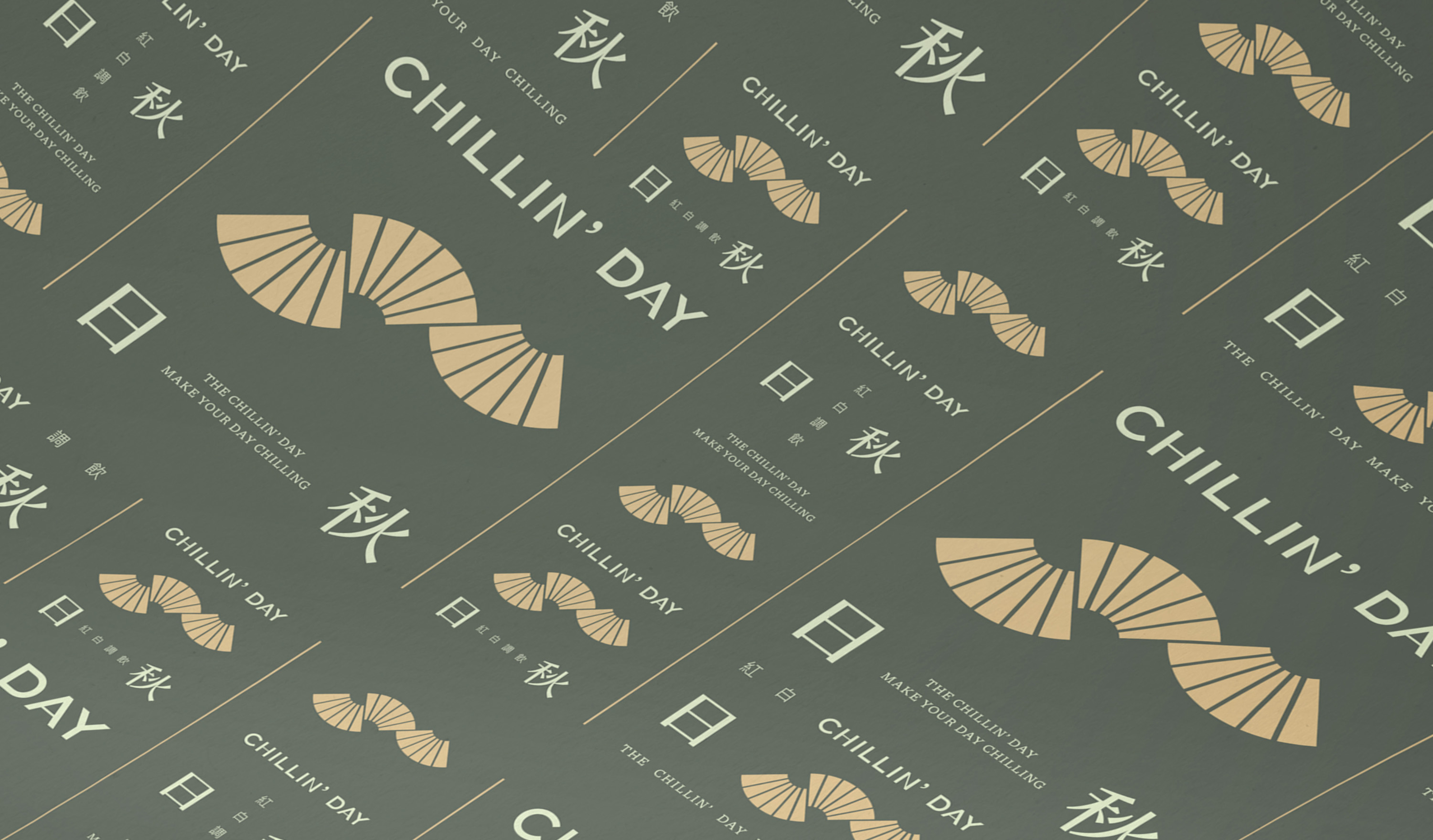
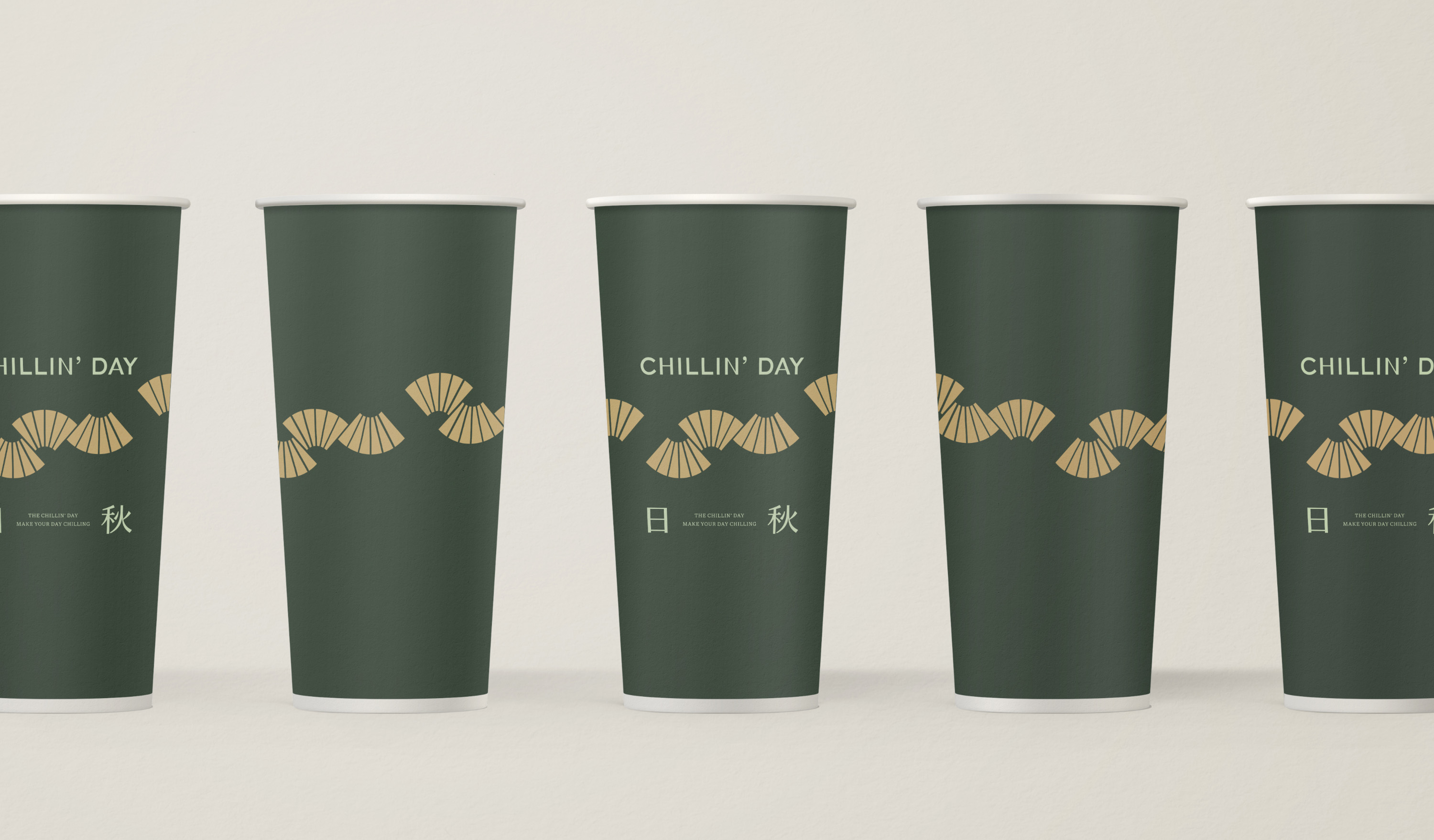
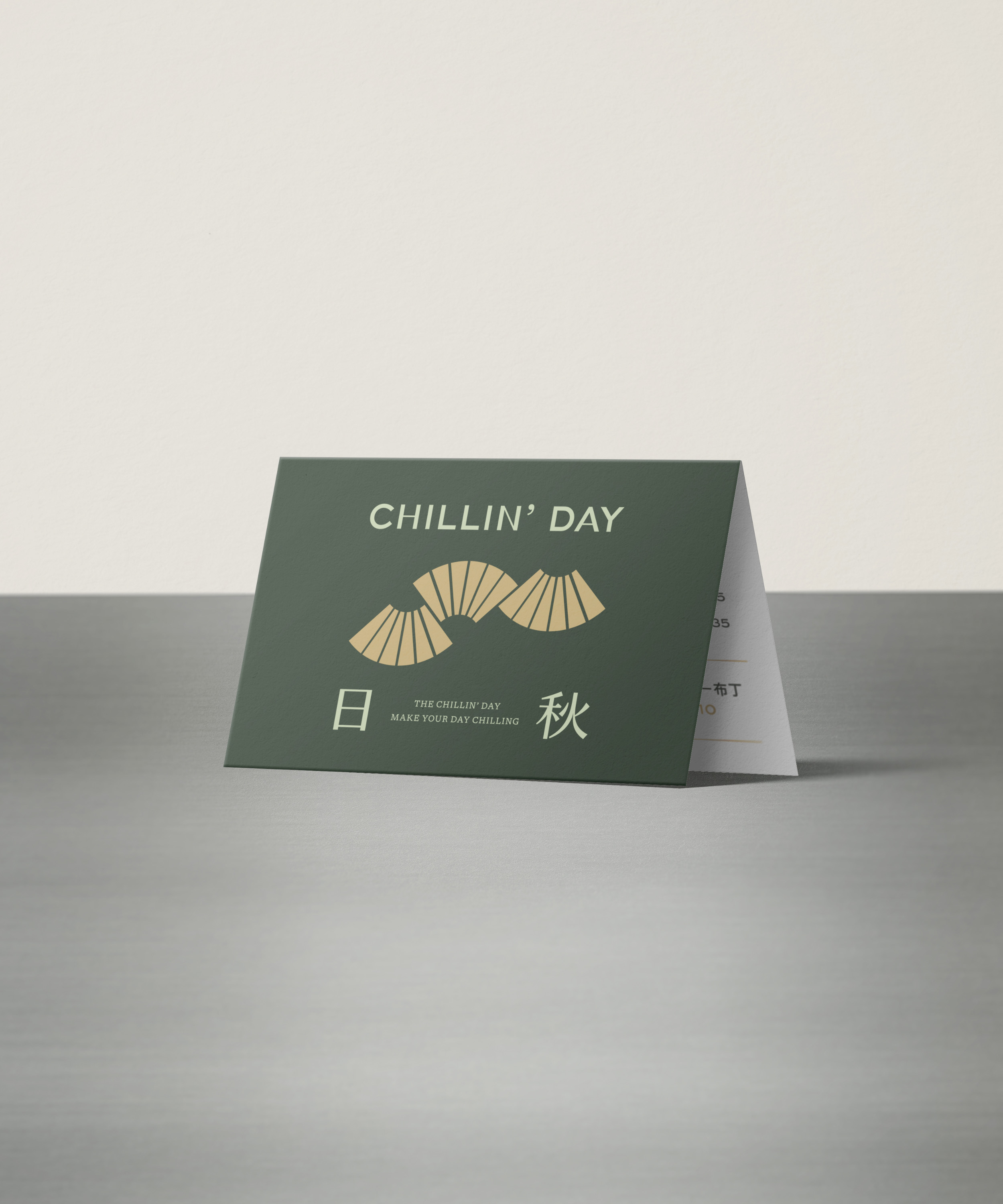
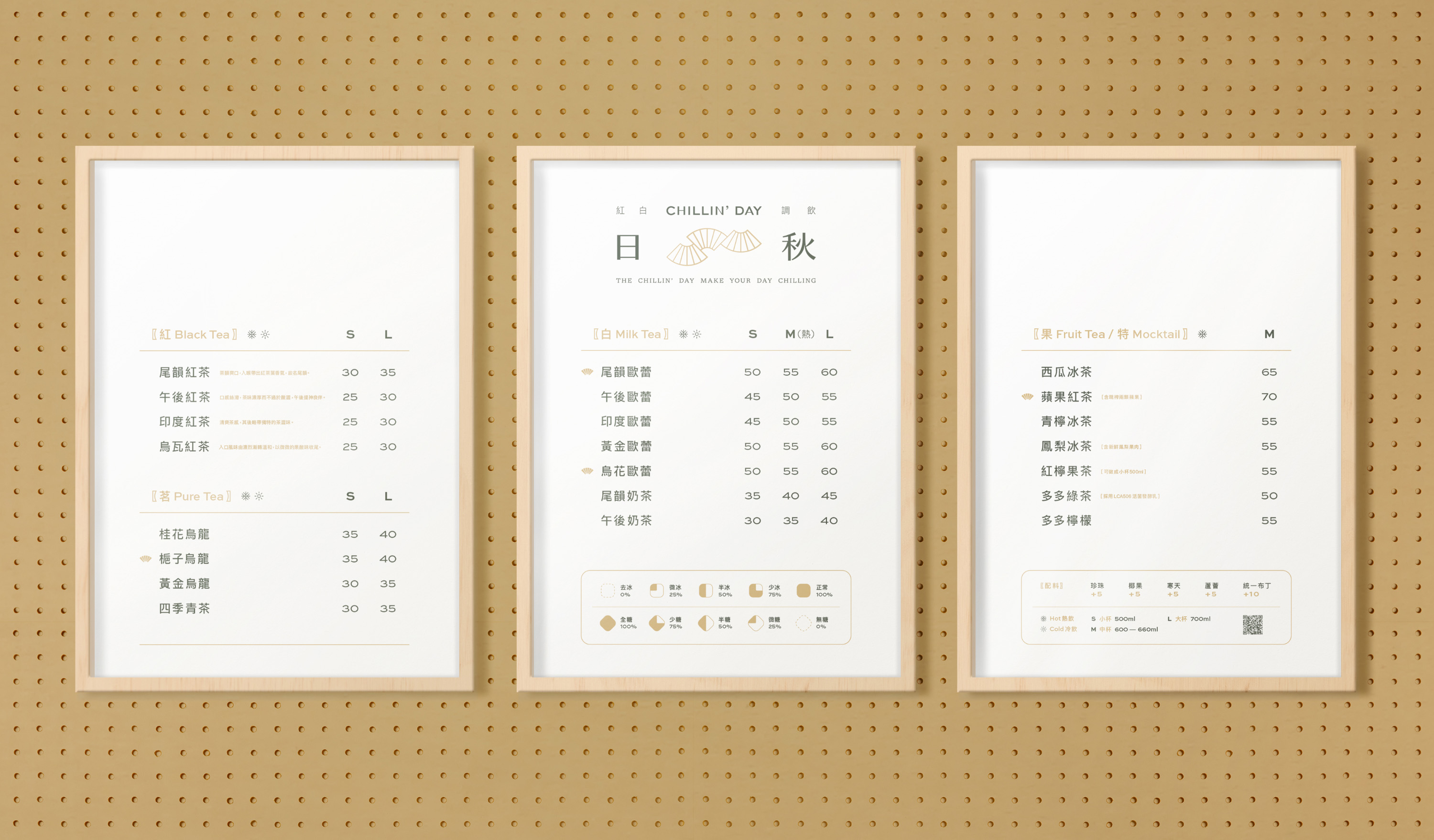
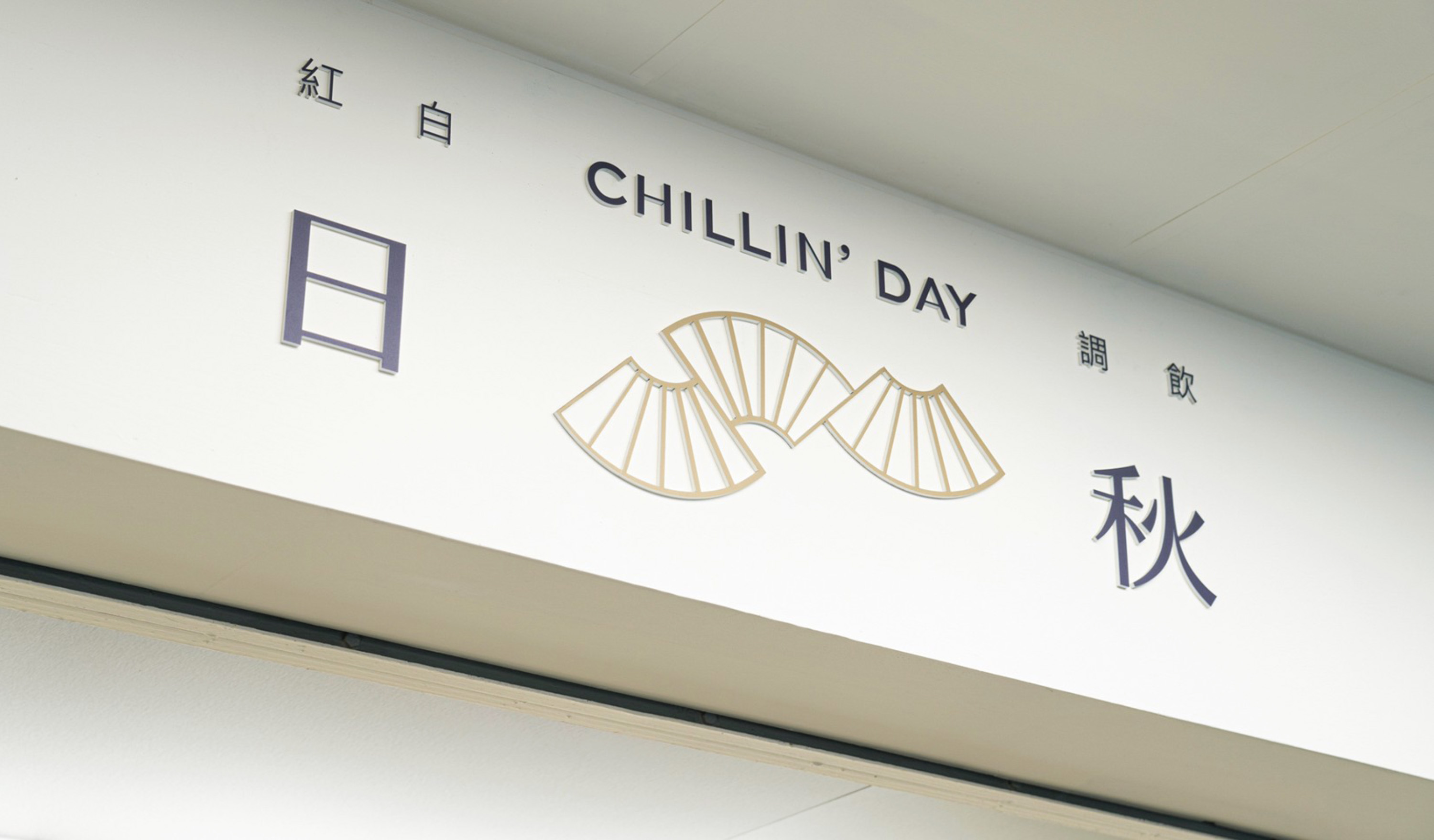
For the brand identity, the selected fan shape, which has extended characteristics combined with gradual thickness in lines, portrays the rhythmic image of “autumn wind.” Furthermore, in the application system, through the arrangement of logo combinations, using symbols, logotypes, and slogans repeatedly to deepen the crowd’s recognition.
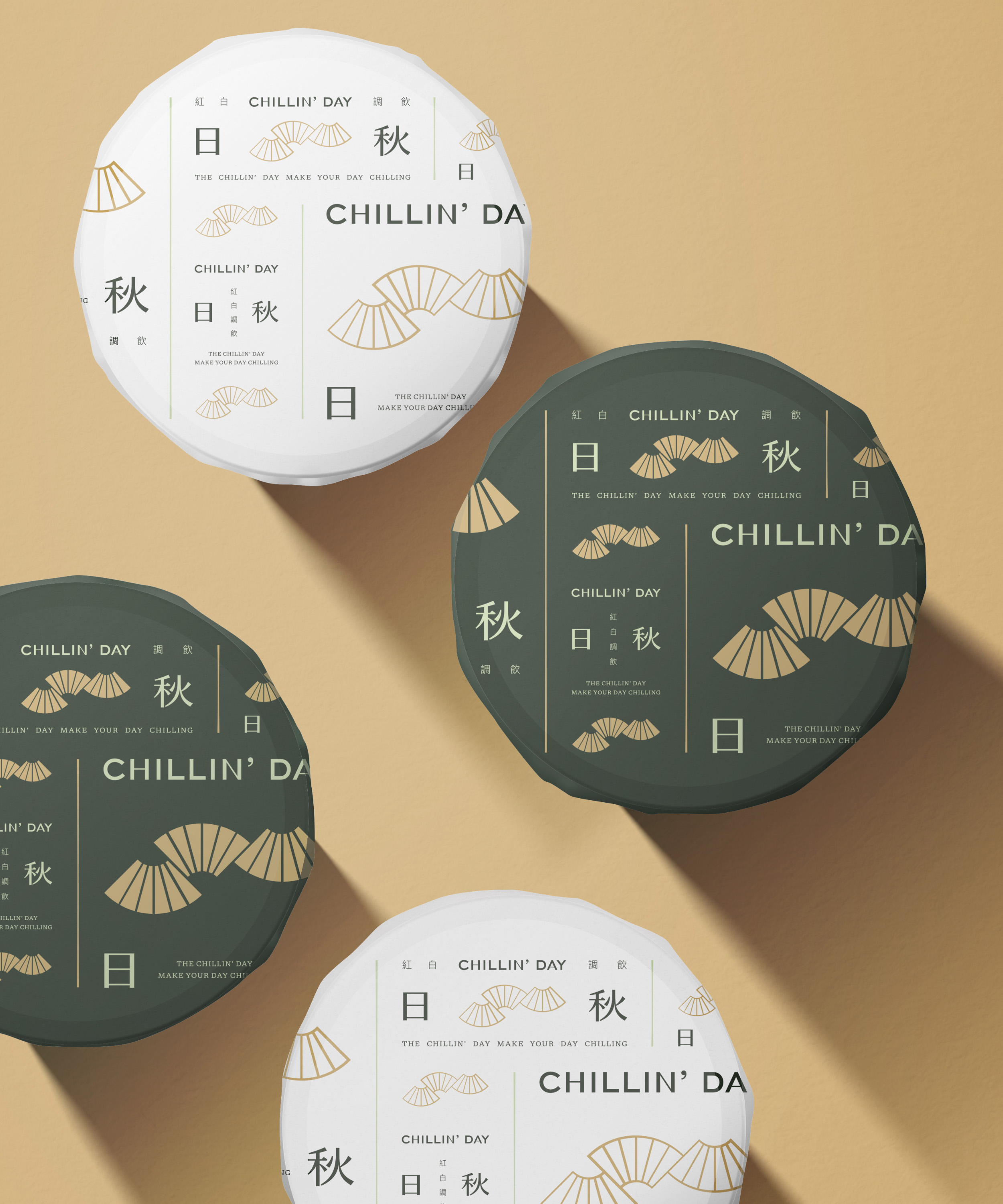
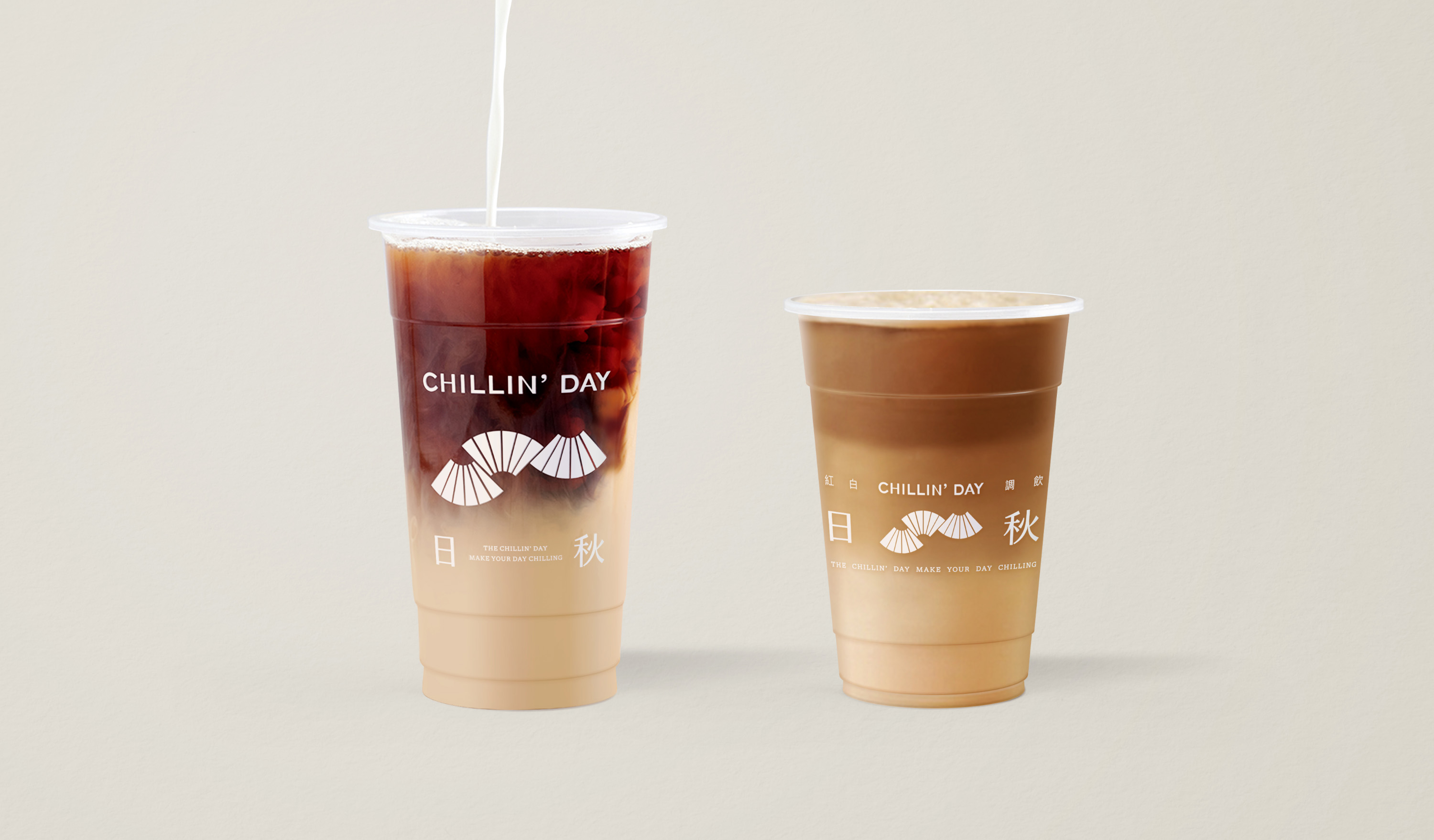
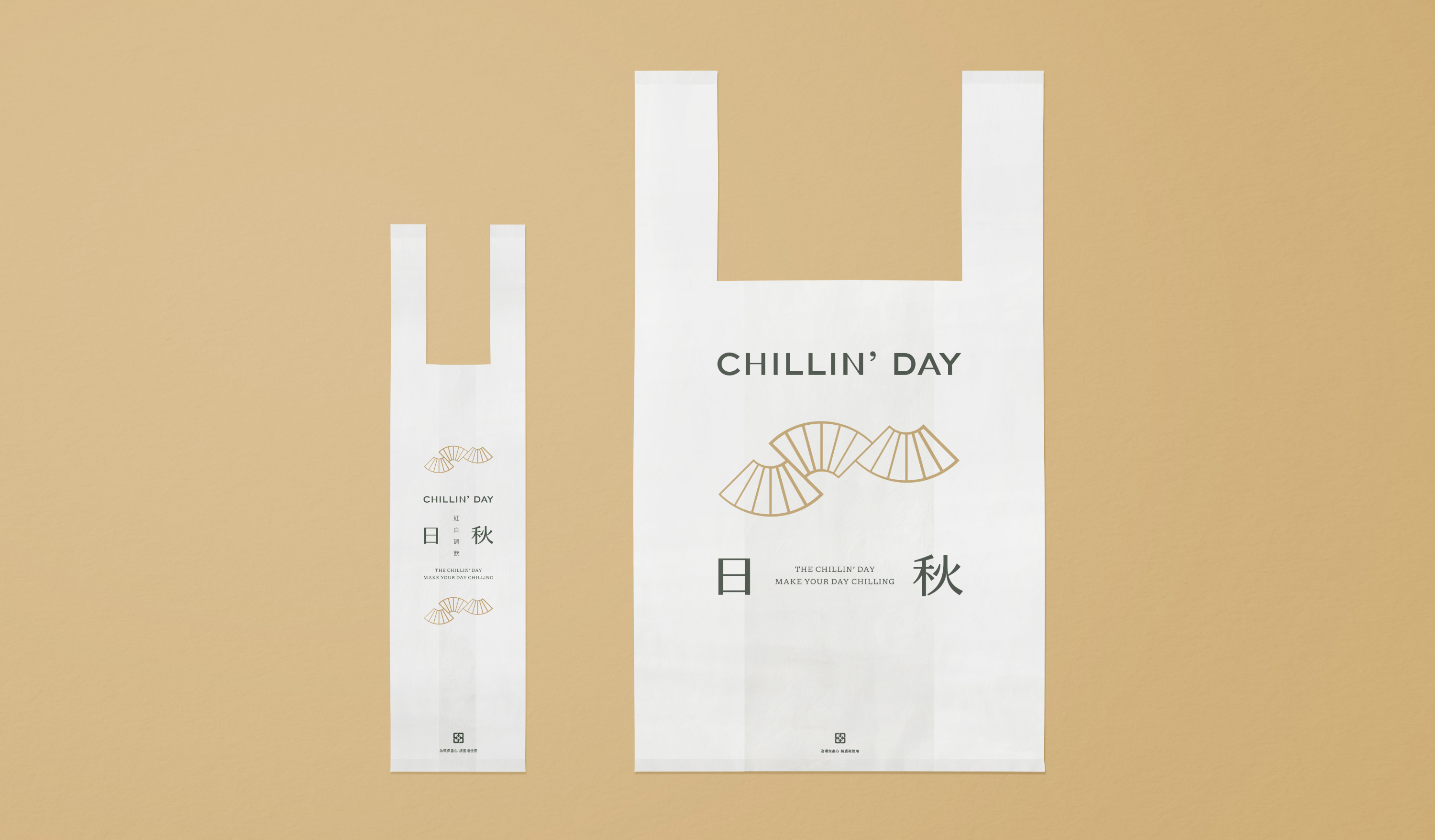
The selected brand color uses sand, and dark green creates an earth tone color palette to ease the busy life surrounding the store and becomes an oasis in the city. For design applications and brand images, use wide-ranging coverage of brand colors and the brand logo; through brand image experience, customers can hold on to brand sprits with relaxed and chill vibes in daily life.
座落於台北東湖的日秋紅白調飲創始店,品牌名 ”CHILLIN’ DAY” 寄寓了日秋貼近日常生活、提供放鬆體驗的品牌精神。以多樣化的茶種及優良原料為根基,調製健康精緻的特色飲品,日秋以定價親民的高品質茶飲及溫暖親切的服務態度,提供在地族群消費者忙碌生活的身心調劑。
賦有延展特性的扇形構成品牌標誌,藉由粗細漸變的線條呈現「秋風」的律動意象。在應用系統上,以標誌、標準字及標語組成複數不同比例的形式呈現,透過重複排列的手法加深群眾對品牌識別的印象與認同。
品牌色彩選用沙色與深綠色調和出大地色系,象徵日秋在店位周邊繁忙的生活步調裡,讓放鬆的氛圍融入繁忙的日常中,成為城市裡的綠洲。在整體應用延伸與品牌形象規劃,透過大面積的標準色系導入結合品牌標誌的運用,期望透過形象體驗讓消費者延續品牌帶給消費者放鬆寫意的生活感受。
T Branding Y 2021 AD Yu Chien Lin D Wei Yun Kan, Allison Hsiao ID Zhi Ray Wang PM Yu Chien Lin PH Allison Hsiao (Graphic) C Chillin’ Day


Related Projects
![]()
![]()
![]()


© 2015 — 2026 不毛 nomo®creative