

FINELINE
branding
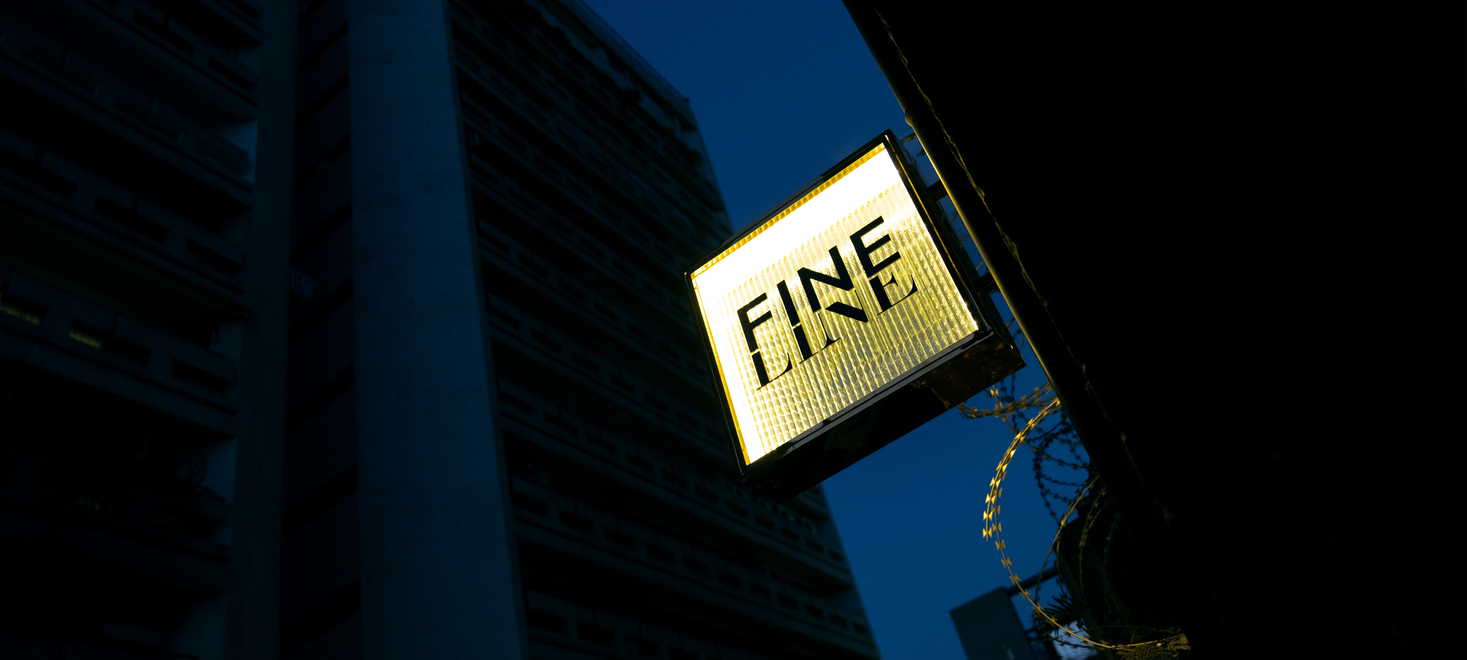
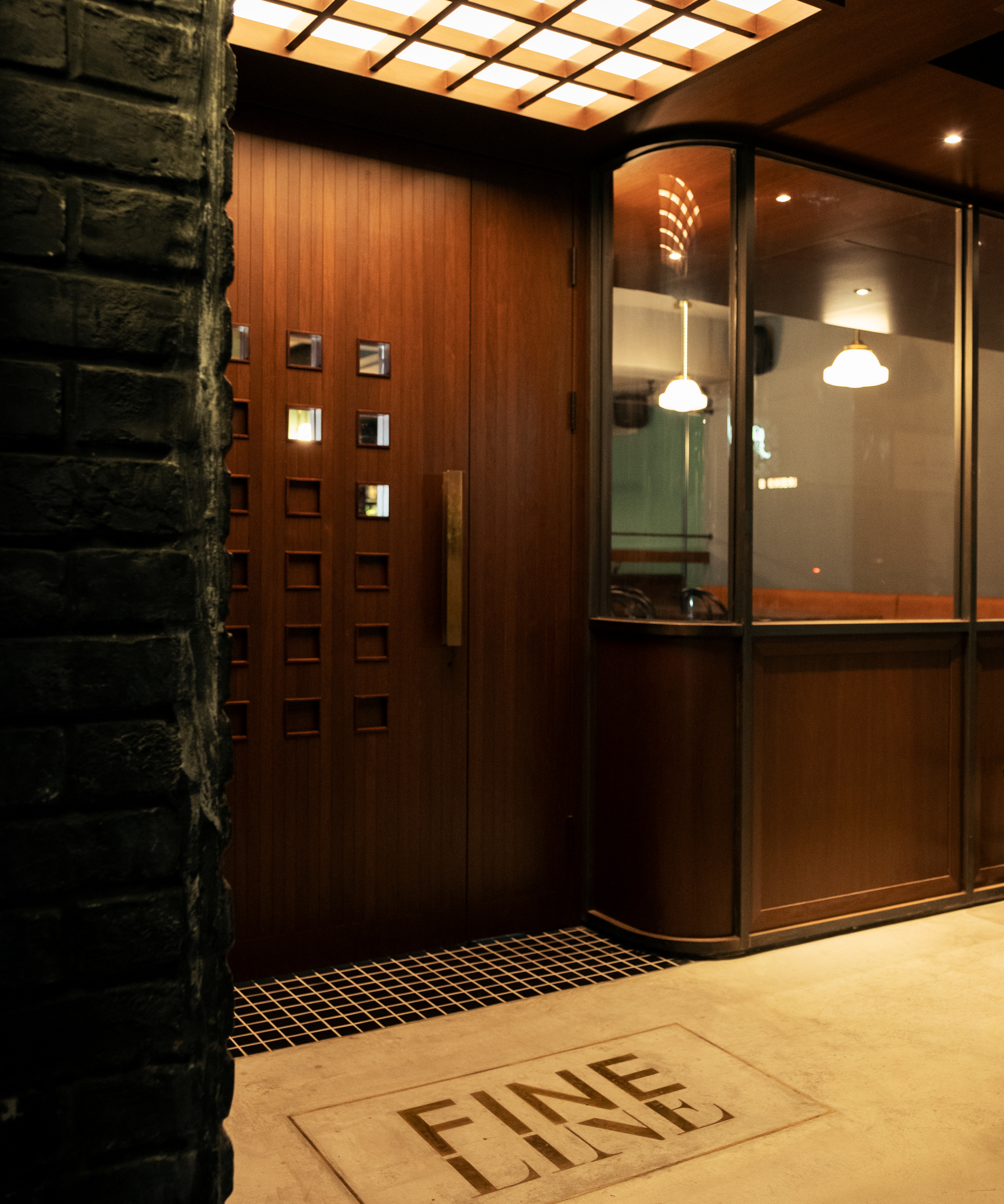
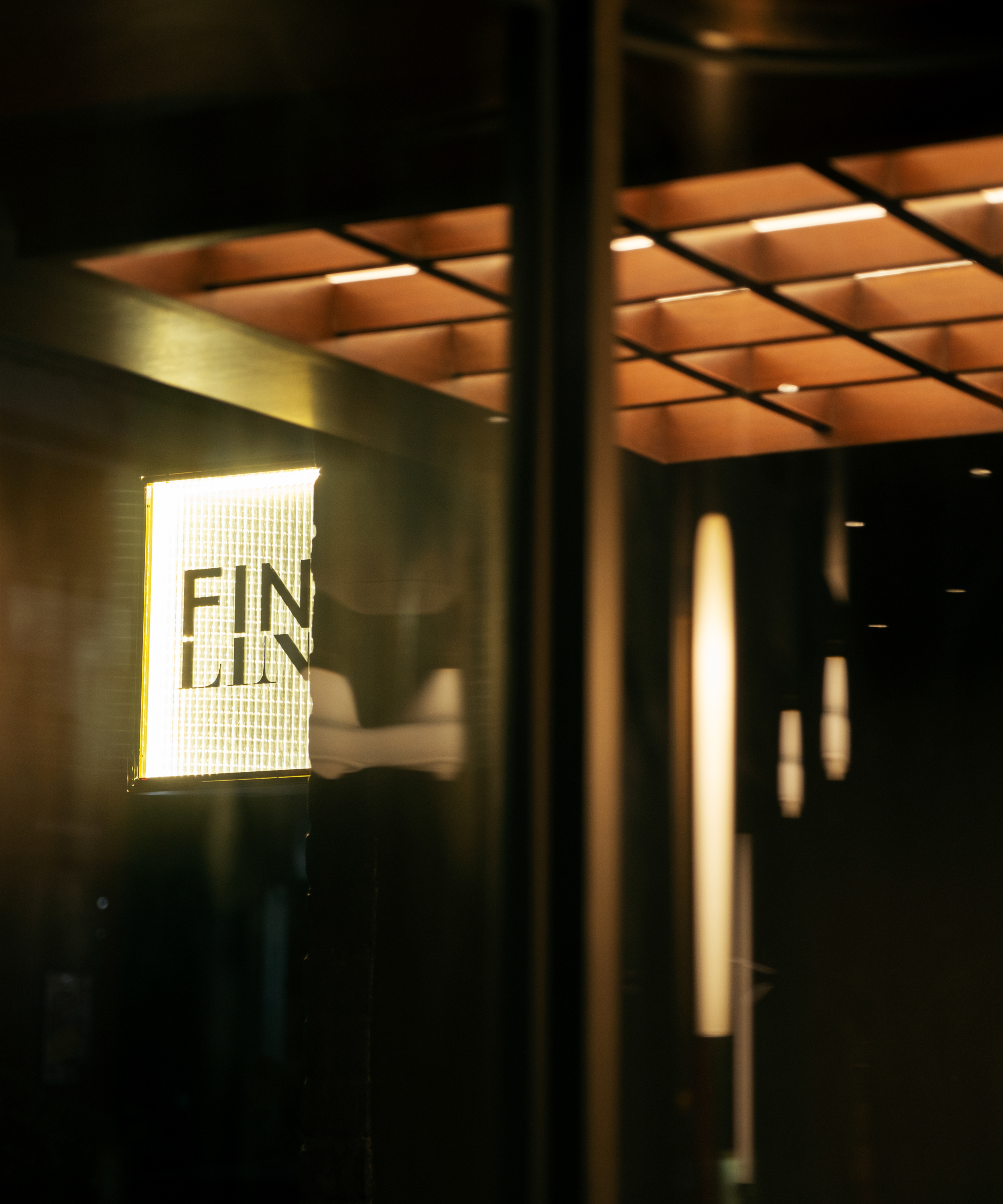
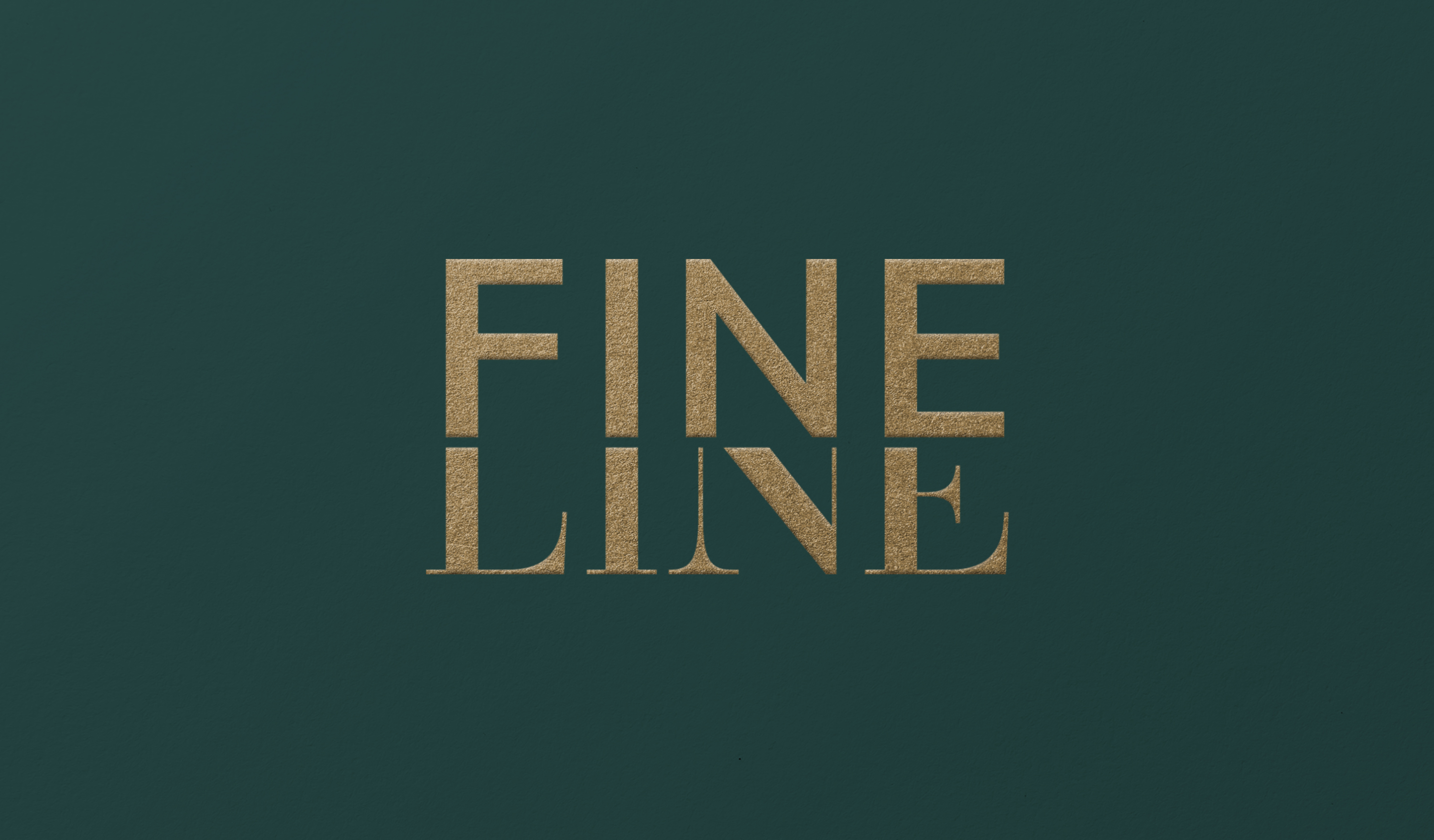
FINELINE is based on the concept of 'the subtle boundary between extreme states'. It embraces innovative thinking that transcends classical and modern standards, unconstrained by frameworks. It cleverly combines the characteristics of serif and sans-serif typefaces to present a unique interpretation of design concepts, drawing inspiration from Optima.
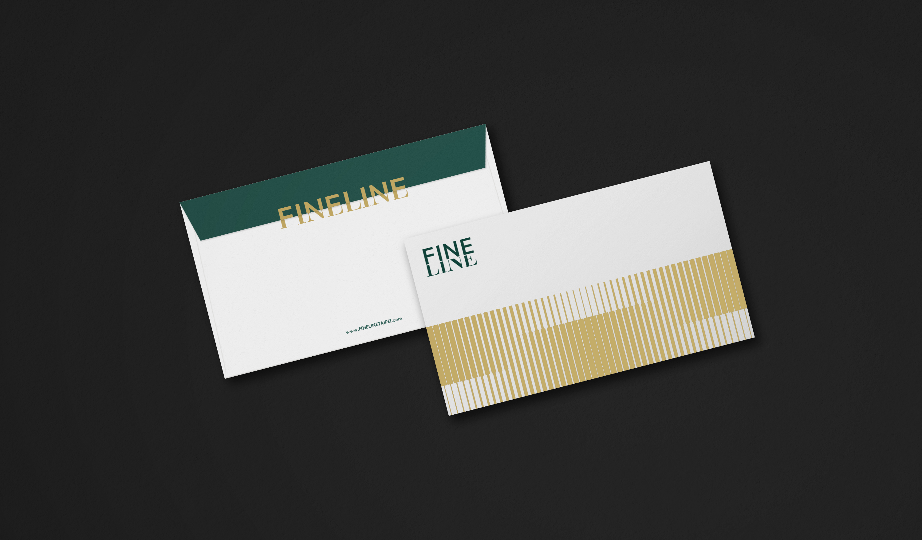
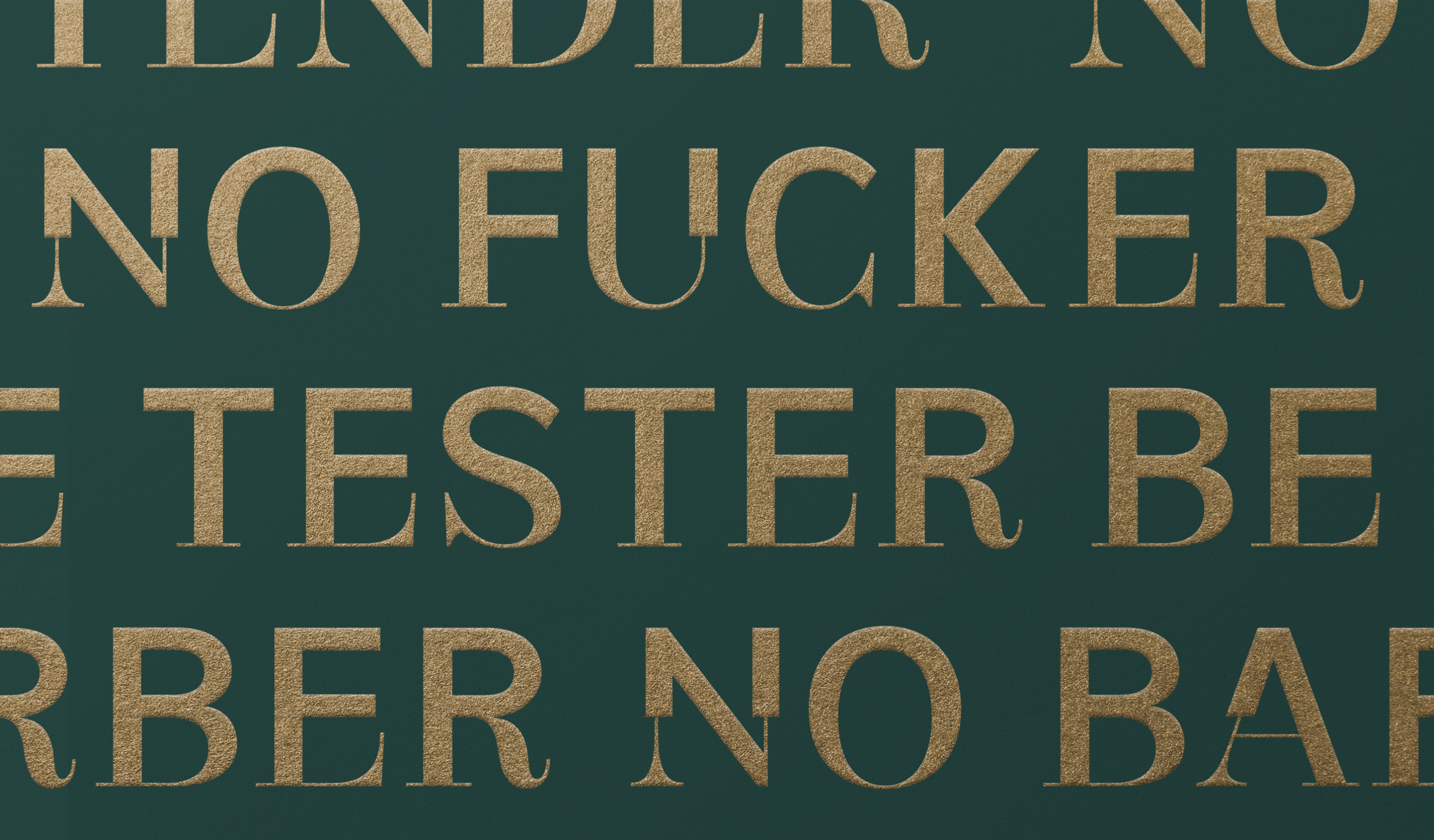
The FINELINE Font continues the spirit of its identity concept, extending from its logo to include 26 uppercase letters, 10 numbers, and various punctuation marks. The font blends characteristics of both serif and sans-serif fonts, presenting a synthesis of differences and expanding upon the context of the extended identity concept.
FINELINE 以「極端狀態間的微細界線」為概念,不受傳統框架侷限、遊走在古典與現代標準之外的革新思維,識別巧妙揉合襯線與無襯線體的歐文字體特色,呈現設計概念的獨特詮釋。
FINELINE Font 延續識別概念精神,從標誌延伸出包含26個大寫字母、10個數字及其他標點符號,字體揉合襯線與無襯線字體特性,表現異中求同、擴展延伸識別概念的脈絡。
T Branding Y 2022-23 AD Yu Chien Lin D Wei Yun Kan, Allison Hsiao PM Yu Chien Lin PH AP Hsiehyise C FINELINE


Related Projects
![]()
![]()
![]()


© 2015 — 2026 不毛 nomo®creative